Webflow Best Practices for High-converting Sites
Creating the optimal web user experience—one that supports conversions and business success—often requires design testing and iteration. Until recently, experimenting with various web configurations could get expensive, with significant changes to a site’s architecture requiring costly coding and CSS changes. But automated web builders like Squarespace, Wix, WordPress, and Webflow have drag-and-drop canvases, custom page layouts, and configurable content management systems that make it possible for marketing divisions, web design groups, and individual designers to create and edit websites without writing a single line of HTML or CSS code.
The ability to rapidly assemble, launch, and refine landing pages, blogs, and websites is also a big advantage for businesses. On its website Webflow highlights case studies with a customer who built websites four times faster and another who boosted conversions by more than 25%—and I believe them. As a freelance UI/UX designer with a decade of experience coding websites from scratch, I’ve used Webflow to create a web-based portfolio template for creative professionals in just five days, and to design several custom sites for clients. The tool has radically transformed the way I work, cutting the time it takes me to design a website in half, thus freeing me up to focus on the landing pages and interactive elements that drive organic traffic and boost conversions.
While automation might seem threatening to designers and developers who have spent years honing their respective crafts, I’ve found it to be remarkably empowering. Here’s a closer look at Webflow best practices and capabilities, and how you can leverage them for business success.
Optimize With Ease
The first client website I created using Webflow was for a Serbian business consultancy specializing in legal and tax advice. The client wanted a self-hosted site under 10 pages that could be built on a tight budget in just weeks. It needed to be fully managed by existing nontechnical staff so the firm wouldn’t have to hire new employees. It also had to look good, with a color palette, font family, and selection of photographs and subtle animations that would reflect the personable, trustworthy quality of the brand. For all these reasons, Webflow was a good solution.
I began the project much as I had with former employers and clients. Collaborating closely with the leadership team, I developed a design strategy with a target market and defined goals. From there, I built wireframes in Balsamiq and used Figma to produce a master page of reusable design elements. Using a plugin, I brought these elements into Webflow and grouped them in custom classes to carry a clean, consistent look across the site.
The project diverged from my earlier web design experience during the refinement and optimization phases. After importing my design assets into Webflow, its drag-and-drop environment made it remarkably easy to add, rearrange, and organize components in real time. In the past, this kind of experimentation would have required coding changes manually and then toggling between an HTML display and a browser window to track my progress—a draining and time-consuming task.
I also leveraged Webflow’s responsive design preview and testing tool. Google and other search engines crawl and index websites based on their perceived value to users, and websites that load quickly and automatically adjust their displays to a user’s device appear higher in search engine results pages. With more than half of all web traffic coming from mobile devices, and Google using the mobile version of a site’s content as its predominant method for indexing search results, responsive design has become closely linked with improved web visibility, load times, and click-through rates.
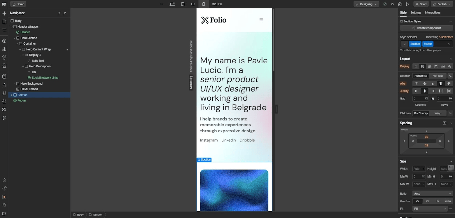
Webflow uses CSS media queries and four predefined templates—mobile, tablet, desktop, and large screen—to ensure your site’s layout, images, and font sizes look clean and legible across devices. Rather than you having to manually code breakpoints and define element scaling rules, Webflow does the work for you. Moreover, it lets you preview the site’s appearance on various devices and make tweaks to the grids and margins with a layout tool. In addition to looking at Webflow’s preview, I recommend viewing your site on a range of actual devices in order to find and fix problems.

While the consultancy client primarily wanted an efficient, functional site for the purpose of adding and editing articles and SEO content, leadership also wanted to support a dynamic user experience. So I tapped Webflow’s scroll- and hover-based interactive features like animations, light boxes, and videos. Without writing any code, I integrated an animated tile of staff profile pictures that gave the illusion of tilting on a 2D plane when you dragged the cursor across employees’ faces. The animation was a small touch, but it drew users’ attention to the approachability of the staff. It also encouraged visitors to linger on the webpage, and, for those sufficiently enticed, sign up for free consultations, an important first step for the consultancy to secure new business.
Improve Collaboration
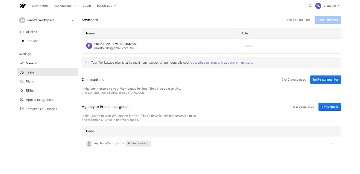
Collaboration is crucial for any design project, yet it’s easy for communication processes and file sharing to become confusing and disorganized. If you’ve ever encountered a file named, say, “Final Final Second Draft,” you understand the importance of version control. Webflow has a feature called Workspaces that lets multiple people collaborate on a project at the same time (similar to Google Docs). Once invited to the workspace, team members can edit and update files in real time, comment on specific page elements, and send direct or group messages to colleagues. Having a shared file serve as a single source of truth helps avoid the confusion of multiple drafts floating among departments and distributed teams.

I particularly appreciate how the straightforward role and permission settings in Workspaces clarify design team responsibilities—helping to avert power struggles and prevent work from being overwritten. Another collaboration tool that boosts productivity is a page-branching feature that allows multiple designers to work on separate pages in parallel without affecting the live site.
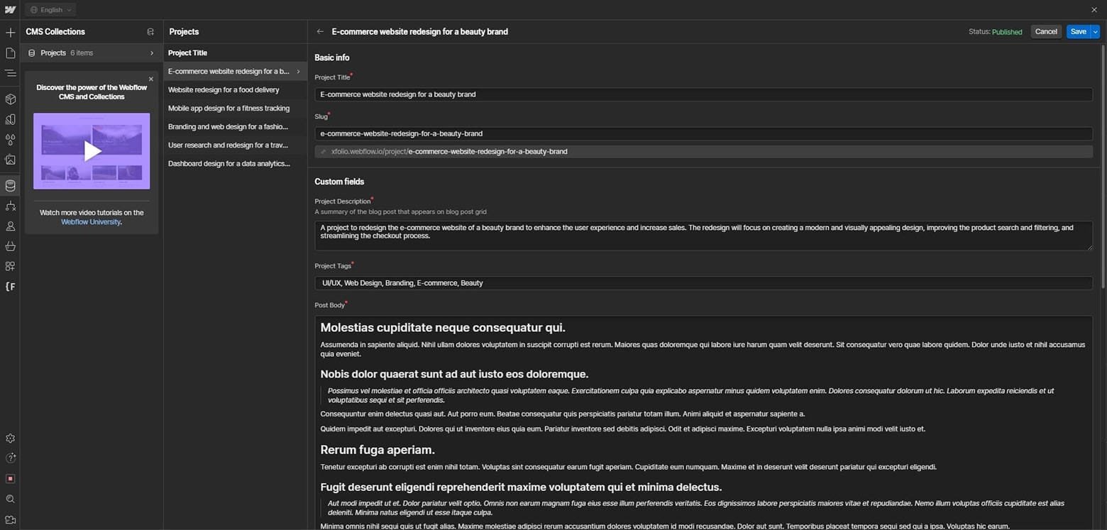
In my experience, Webflow empowers copywriters, strategists, and content and product marketers to do what they do best: write and edit. With access to intuitive front-end editing tools, the content team doesn’t need to ping an engineer to reformat a snippet box or add a video animation to a product page. Once assigned to an editing role, an individual or team can use Webflow’s built-in content management system (CMS) to update blogs and website copy, organize and upload photos and videos, and write alt text for images.

Maximize Conversions and Reach
In addition to designing a functional and aesthetically pleasing website, you will need to find and manage the many tools and data sources your clients need to run their sites after the project ends, which can be challenging. Fortunately, Webflow brings a host of integrations and tracking tools together in one place.
For instance, I once enabled multilingual support on a client’s Webflow site by integrating a third-party translation provider. With this simple yet efficient fix, the client’s website became accessible to a broader range of users worldwide. Additionally, with integrations for e-commerce systems such as Shopify and WooCommerce, you can empower your clients to process orders, sync product catalogs, and administer their online shops from a single dashboard.
Webflow’s integration with analytics and reporting services like Hotjar and Google Analytics allows you to evaluate the effectiveness of a site’s design. For instance, you can pinpoint pages and components needing UI and UX improvements by leveraging data such as heatmaps, rage clicks, and bounce rates.
Once I’ve set up integrations for a client’s site, I utilize them to include fresh features and functionality, such as email opt-in forms, product pages, and social network feeds. Integrations may also be used to automate processes and save time on things like newsletter distribution and social media posting.
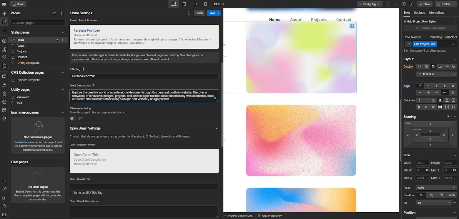
In addition, I use Webflow’s fine-grained front-end SEO controls to boost my clients’ search performance and draw more traffic to their sites. With simple menus and semantic controls for image sizing, page titles and descriptions, meta descriptions, URL redirects, and loading preferences, you can optimize a site with minimal reliance on external plugins or engineering support.
Finally, an AWS-powered hosting stack distributed across 100 data centers (one of the factors that appealed to my consultancy client) ensures sites load fast and can handle heavy traffic. This ability is beneficial for site visitors and also boosts clients’ site rankings in search engines that factor load speed into their algorithms.

A Scalable Solution
It’s worth noting that Webflow isn’t without drawbacks. The company offers a free starter plan, but premium options can be pricey, particularly for larger teams or enterprises. For companies that want to create a highly customized site with advanced functionalities, such as image galleries and order booking systems, it may not be the best fit. Webflow does offer a method for adding custom code, but the results are less nuanced than what a developer can accomplish with a code editor, and users unfamiliar with HTML, CSS, and JavaScript will find the feature fairly unhelpful.
Still, I appreciate the cost and time savings Webflow offers. In my experience, its collaboration features are key for boosting efficiency by allowing marketing, design, and engineering teams to co-create websites in real time, rather than in siloes, so important ideas don’t get lost. Beyond that, I’ve found Webflow to be an extremely user-friendly tool. With these Webflow best practices and little to no coding experience, designers can make responsive websites with attractive layouts and design elements superior to those of their competitors. Most of all, the speed of Webflow as a design tool allows me to quickly adapt a website to user and client needs and iterate as needed to boost conversions.


