Visual Storytelling in Design: Captivate Audiences

Audiences are overwhelmed. As information and messaging proliferate, people can’t keep up and they disengage. But visual storytelling can break through that mental fog and help people digest and make sense of information, regardless of the medium or message.
There are many ways to communicate information: Infographics, videos, animated slide decks, event designs, wall prints, and interactive museum installations are all forms of presentation design. Toptal designer Lucía Merlo has worked on presentation design projects for renowned cultural institutions like the National Aquarium in Denmark and the Museum of the Future in Dubai, as well as corporate clients like Lego and Ikea. In this Q&A, Merlo explains her approach to storytelling and shares real-world examples to help you make a bigger impact on your audience.
This conversation has been edited for clarity and length.
How do you incorporate storytelling in design? What role does it play in your process?
Storytelling is critical in my work as visual designer. In essence, my job is to take all the information and content I receive from a client and turn it into a compelling narrative that people want to stop and pay attention to. As for my approach, it depends on the format.
Storytelling in infographics
For an infographic that could be distributed in a variety of contexts, including as a social media graphic, I start by creating a global shape that broadly conceptualizes the information and piques the viewer’s curiosity. For instance, if you’re creating an infographic about ocean life, the container for the graphic could be a seabed or a wave. From there, you can use scaled layers of text to provide information and tell a story. The visual form of the storytelling graphic should be a metaphor for what you want to convey at a more granular level. As inspiration, I often think back to an installation by Stefan Sagmeister and Jessica Walsh called The Happy Show, which uses gumball dispensers to reflect the audience’s happiness. It’s a perfect example of a visual metaphor.
Storytelling in videos
For videos, I pay close attention to the narrative arc, which often means presenting information in a linear way. I ask myself: How is the problem introduced? How does tension build? What are the plot twists? What is the climax? What is the resolution? Whether it’s a 10-second video or a 60-minute documentary, the audience’s understanding of the content is a primary focus when creating a story. Audience perception should guide narrative decisions like a lighthouse. I often work with clients to declutter video content because viewers’ attention capacity keeps shrinking and we shouldn’t assume they will find the time and mental energy to absorb long or complex messages. I also caution against investing in video styles or graphic techniques that aren’t necessary to convey the message but require significant resources to produce.
Storytelling in 3D
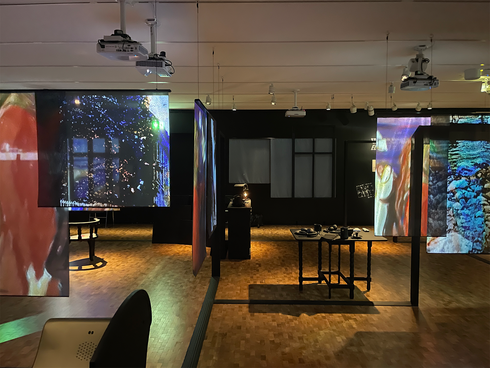
When designing exhibitions and physical spaces, I imagine I’m walking through a home. Much like a home implies a certain route—you enter through the front door and explore room by room and floor by floor—there is a standard path to the visual sequence that unfolds in an exhibition. For instance, I introduce the theme at the beginning of the immersive experience, present several subthreads, and then progress to a resolution. But the path is not strictly determined. The visitor should feel free to discover it in their own way, jumping from room to room. I also like opening small windows into the different subthemes.
For instance, in Shadows, an interactive exhibition I helped design for the Edvard Munch museum in Oslo, some of the information is found inside drawers. Hurried visitors will skip that part, and that’s fine, but the nerdy ones will spend time discovering those sublayers of information, making it a more memorable experience.

What are key elements of visual storytelling that make presentation design engaging and effective?
Simplicity is key. For visual stories, you have to have a clear hierarchy so people know what to look at first and where to go next. We can learn a lot about this approach from the Swiss Style, also known as the International Typographic Style. The principles of this style highlight key elements of an organized, hierarchical layout, such as establishing a limited number of font sizes for headings, subheadings, and body text, embracing whitespace to give elements room to breathe and to focus attention on the most important elements, and avoiding unnecessary embellishments that don’t enhance meaning.
Visual elements should play a role in the story and serve a specific purpose. For example, I often work with content that is written in business language with a lot of acronyms and complex terminology. Clients appreciate when I can make that language more accessible through imagery—such as including cartoon characters who express complex ideas plainly in thought bubbles. Visuals like these can aid understanding and create an emotional response that is crucial for sparking engagement.
Minimalism is a useful concept in visual storytelling: What is the most economical way I can explain a feeling or concept without superfluous language? I might have a character sitting down or slumped over in a chair to convey the frustration of waiting. When you select and arrange images, you can often use fewer words and still achieve clarity.
Of course, words are instrumental in visual stories as well. In most of my projects, I write the copy in addition to creating the drawings (though sometimes I collaborate with a writer). Usually, I find that writing the copy allows me to be faster and more fluid in my process—I understand the story, and I know how to tell it in a structured way.
In presentation design, what is your approach to understanding the brand’s voice and audience?
To get to know the brand, I ask the client a lot of questions. I find it’s best to get creative, because if I ask simply, “What is your brand’s personality? or “Who is this project for?” they may give a flat answer. It’s much more interesting and fruitful to ask out-of-the-box questions, such as, “If this audience was an animal, what would it be?” or “If you had to choose three attributes to describe your viewer or reader, what would they be?” You need to ask enough questions to ensure you understand the tone of voice, target audience, and user persona the client has in mind—they know their content better than anyone else, but they may need some probing to articulate it.
When I worked with a waste management company to create an infographic that would clarify the environmental benefits of its new sustainability model to policymakers and public officials, I prompted the client to give the audience a face. The key decision-maker considered this and chose a prominent political leader. With that clear reference in mind, the design strategy came into focus—we could then begin to envision what kind of language would resonate and what would keep this audience interested throughout the user journey. I like those kinds of questions because they help crystallize a vision for the design process.
Can you describe your process for selecting color schemes, typography, and visual elements for a project?
Sometimes those elements are preestablished by the client’s visual identity. At other times, developing them is an exploratory process that involves consultation with the client.
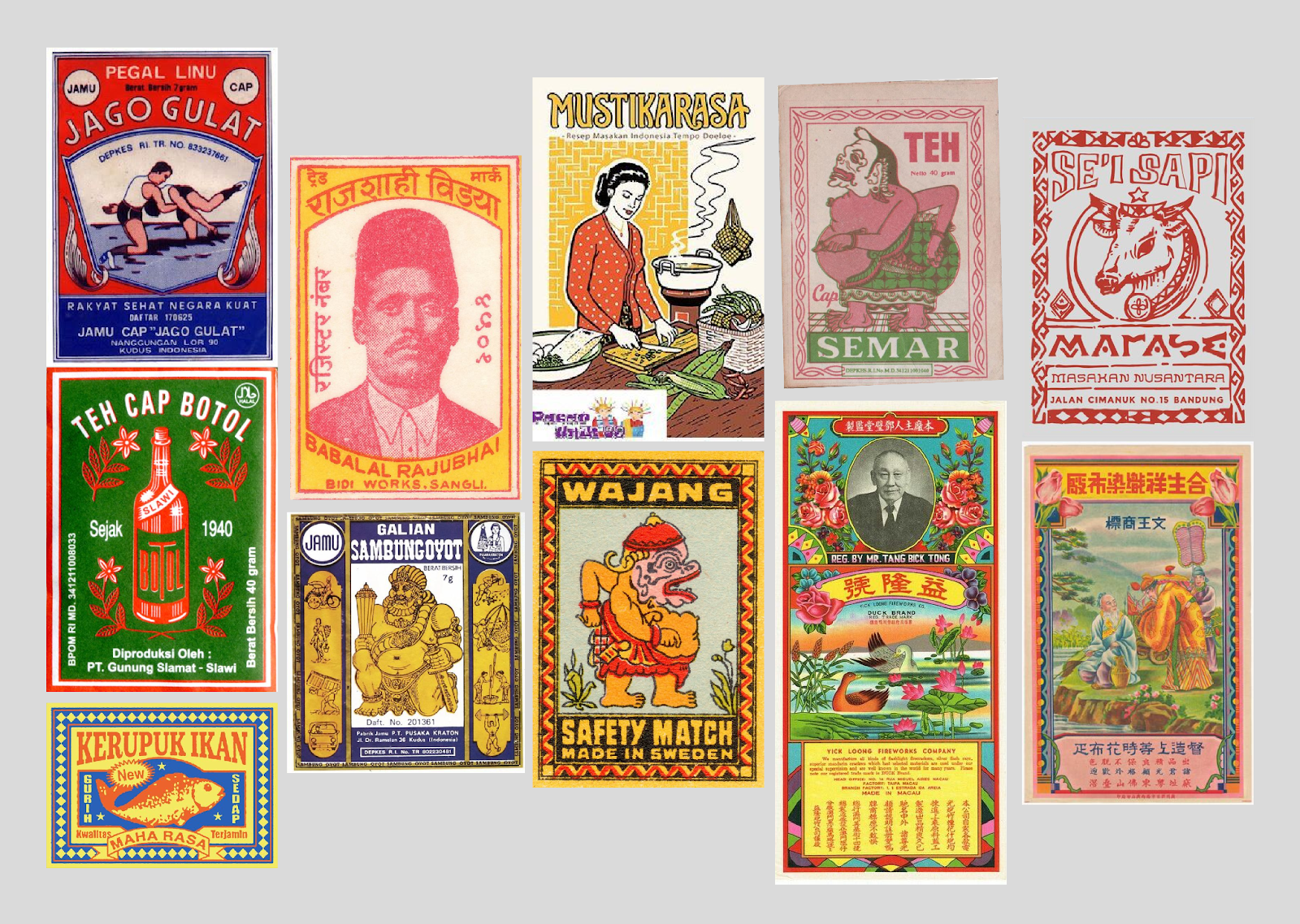
A good example of the latter is a series of slides I created for a food blog about how tempeh is made. I drew inspiration from various examples of Asian vernacular graphic design, particularly focusing on the Indonesian style, as tempeh originated in Indonesia. By vernacular graphic design, I mean the local design styles that emerge from traditional and everyday life. To visualize the style for the slide images, I created a mood board that incorporated old food and drink labels.

The labels feature symmetry, ornamental elements, bright colors, and a mix of iconography and text, which inspired the carousel of illustrations that complement the article about tempeh.
When selecting visual elements, it’s important to be systematic. If I decide circular containers are going to appear flat on the user interface, I’m going to give every single circle in the presentation the same format. Consistency is a critical visual storytelling principle that saves a lot of time. It also makes it easier for the audience to understand the relationships among the various elements and their relative importance.
How have you used storytelling to make complex or technical information more accessible?
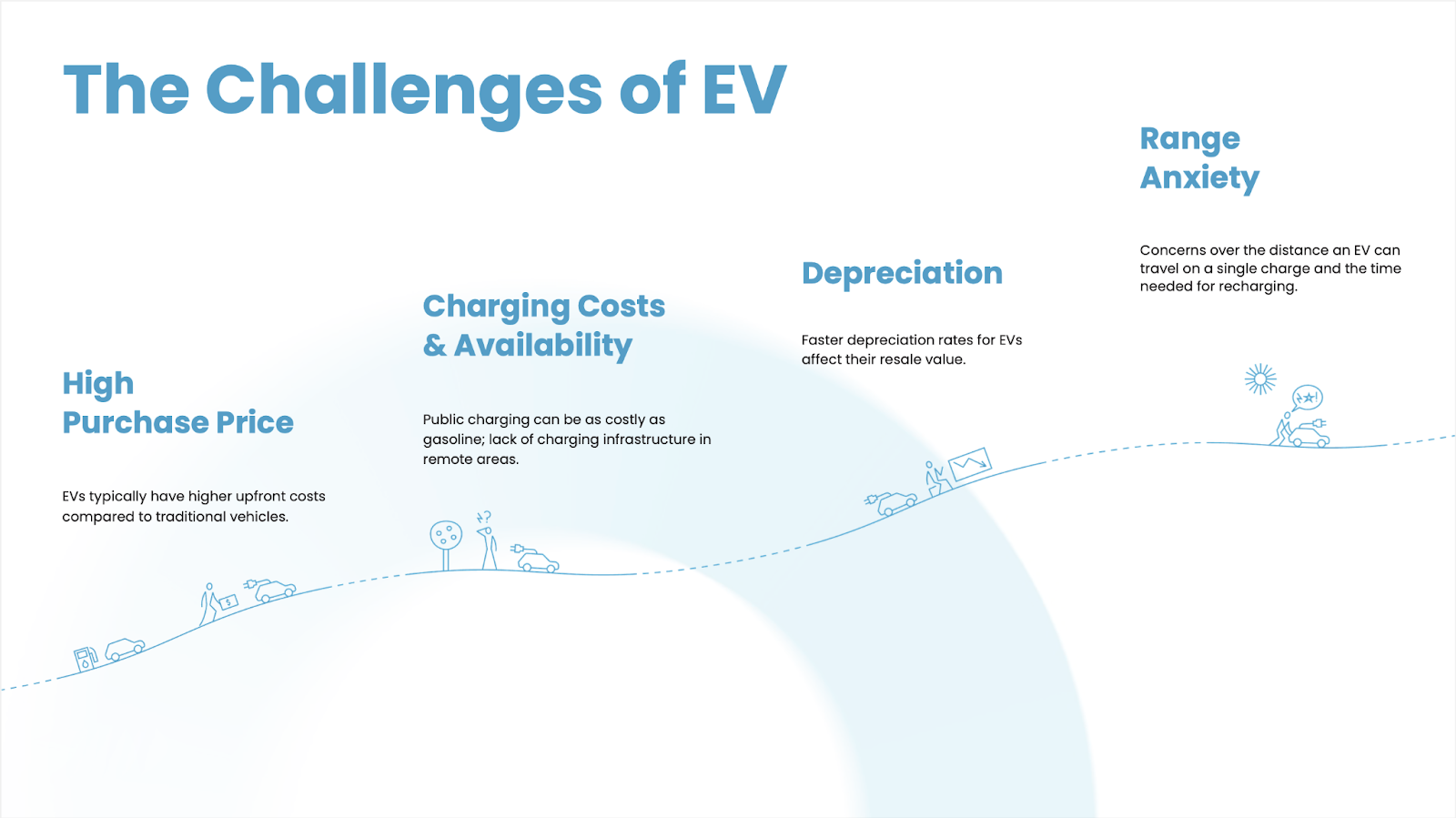
I recently designed an infographic for an online car rental and leasing company. The goal was to win a service contract from an electric vehicle company by showing executives and decision-makers the barriers that people encounter when buying electric cars, and how the car rental and leasing platform is uniquely positioned to dismantle these barriers.
I divided the barriers into four main categories: high purchase price, charging costs and availability, depreciation, and range anxiety. The visual design illustrates a person climbing a hill and confronting these issues, with the person’s emotional state—from confusion to frustration—revealed in their body language.

In this case, the slope of the hill communicates the challenges consumers face and the reward that awaits them: the energy savings and environmental impact of an electric vehicle without the hassles of purchasing, maintaining, and reselling it.
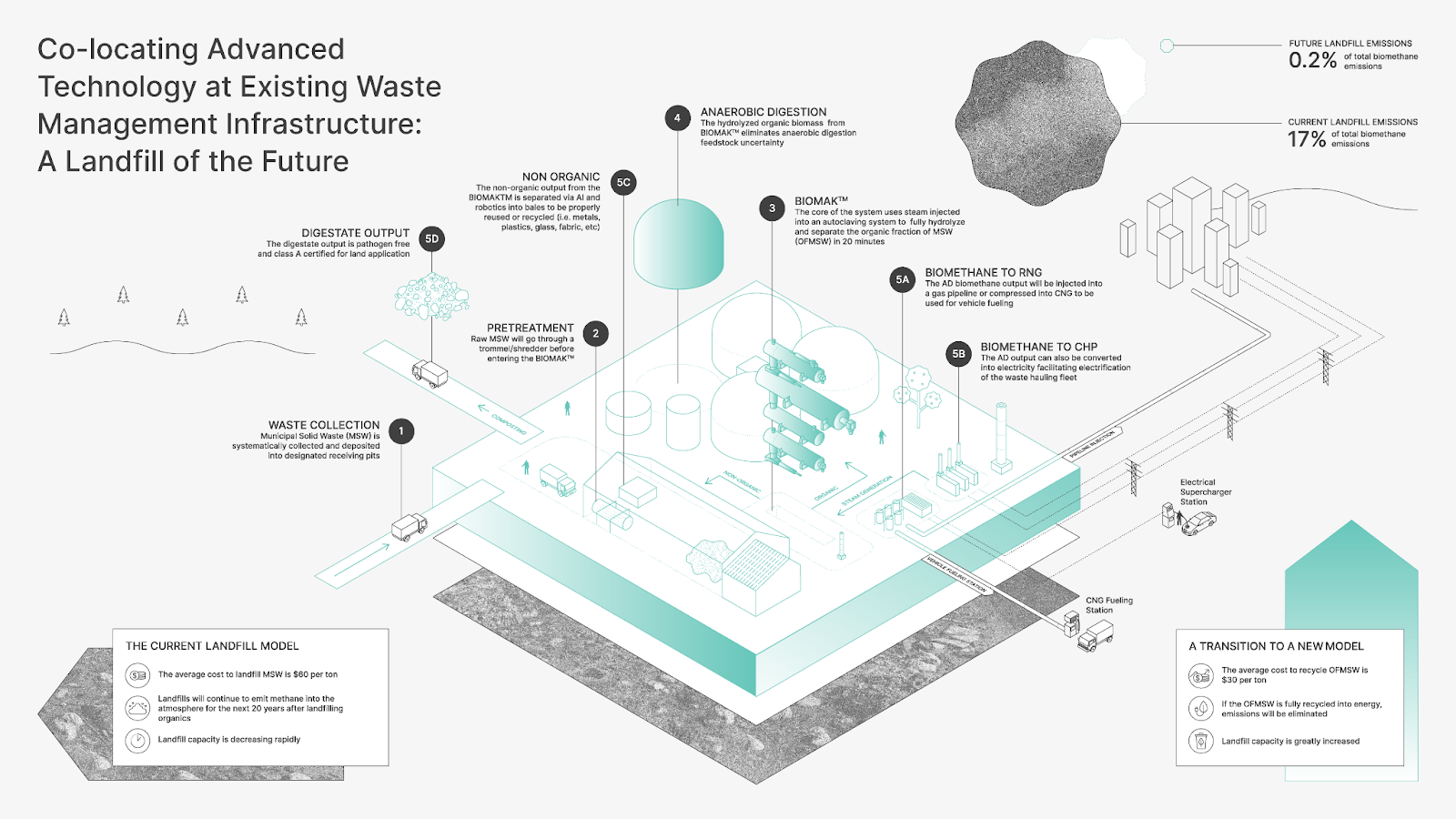
Another example is an infographic I created for the waste management company I mentioned. The goal was to illustrate how the company was moving from a waste management model that relied largely on outdated, ecologically destructive landfills to a sustainable process driven by artificial intelligence (AI). Put simply, the company’s leadership wanted to distill a complex process into a coherent and aesthetically pleasing presentation. The team had compiled a collection of great insights on the environmental advantages of the company’s solution. Still, the insights needed to be organized and stylized in a way that would resonate with key stakeholders and alleviate any lingering concerns.

Design hierarchy, visual alignment, and color choice were critical. Each graphic detail is connected to a brief explanation with a line, making it easier to digest the information in small chunks, and a three-tone color scheme—gray, turquoise, and green—highlights the sustainability of the new solution. I grouped and separated elements as a form of hierarchy: black text above, and green drawings of the model below. I also included a drawing of a traditional landfill in gray as the lower layer to highlight how dirty and primitive those are compared to what the client was proposing. Conflict is important in storytelling because it establishes a problem to be overcome that piques the audience’s interest. In this case, the contrast between the old model and new model was designed to remove any doubt about which is the best way forward.
Do you have advice for enhancing visual storytelling with data or data visualizations?
My advice: Don’t forget that people are people, not machines. They have limited attention spans and you have to connect with their emotional side.
A graph is never just a graph. Even the shape of a graph can communicate information. Depending on the content you’re sharing, it could be structured like a food label or like a building. When storytelling with data, the right container can help you express the concept behind the information and give it meaning. Otherwise, you’re just sharing numbers. People are more likely to remember the story than a specific statistic or result.
I recommend making data as interactive as possible since interactive elements allow users to explore data at their own pace. Separating it into chunks is also a way of simplifying information. People tend to be more engaged when they are following their own curiosity and learning in an active way. On a website, this approach might mean creating clickable elements or filters. In an exhibition, it could be a data display that is triggered when someone enters a room or opens a wall-mounted box that contains text.
Animating data visualizations is another effective tactic that can deepen the connection with the data. The way a graphic element unfolds brings another layer of expression: Is it fast? Is it slow? Is it funny because it bounces like a ball? Animation infuses content with meaning and allows designers to illustrate changes in data over time.
I also recommend simplifying and distilling information as much as possible. There is a temptation to overcomplicate presentation design. Nowadays you can produce content so easily, cheaply, and quickly that people try to explain the world since the beginning of time. But that’s a mistake; you have to select and synthesize.
What trends or emerging technologies do you find particularly exciting or impactful in this space?
One exciting capability is personalization. For example, you can make an infographic specific to the reader of a newspaper. Sometimes I get an email newsletter with a very detailed report on what’s going on in a certain political area. The fact that it has my name on it and is directed at the target audience I belong to makes it really cool—I’m reading something that is made for me. Technology has made it incredibly fast and easy to personalize content, which has opened up all kinds of possibilities for visual storytelling in design.
In addition, I find generative AI to be a great learning tool because I can research and understand a topic very quickly. Say I start a new design project in which I need to create a visual about regenerative agriculture, and I don’t know anything about that topic—I can ask ChatGPT to explain it to me. Of course, I’ll cross-check everything against authoritative references, but AI is a helpful learning tool that has made me much less dependent on clients at early project stages.
What guidance do you have for designers looking to improve their storytelling skills and stand out in the industry?
I recommend reading a lot and finding inspiration outside the digital design world. I very much admire comic writers and cartoonists, people like Moebius (Jean Giraud), Hergé (Georges Prosper Remi), and Chris Ware. They understand how to structure a story from beginning to end, from chapters to vignettes. Chris Ware, in particular, changed my thinking. He helped me realize that everything has to be really systematic and made into modular blocks that can be configured into larger stories.
Step away from Pinterest and go to exhibitions and museums, places where you get visual input that can spark new ideas or directions in your work. This is especially important when designing physical spaces. Looking at art from diverse places and across mediums is a good way to teach your brain how to use visual language in different formats.


