UX Design to Increase Website Conversions: A Guide

Our daily lives are filled with choices and decisions, many of which we make subconsciously. These choices, including how we interact with digital products, from browsing a website to clicking the “Buy” button, are subtly swayed by cognitive biases and emotional responses. In fact, some researchers posit that a majority of purchase decision-making takes place in the subconscious mind.
In the UI/UX design world, small details carry significant persuasive power. When tactically implemented, subtle animations, microcopy, and visual cues can inspire users to subscribe to a newsletter, create an account, or complete a transaction. By understanding and applying knowledge about common human tendencies to their work, designers can influence user decision-making and drive conversion rates up. They can also facilitate better user experiences.
I have been a product designer for eight years, specializing in applying human behavioral patterns to UX design to improve website conversions and develop successful digital products. Here, I discuss how four behavioral principles—reciprocation, commitment, social proof, and scarcity—can influence user decision-making and optimize conversion rates.
Give to Receive: Incorporate Elements of Reciprocation
Reciprocation is based on the idea that people feel obligated to repay a favor or gift they have received: Give a little something to get a little something in return. Applying elements of reciprocity to digital products can boost user engagement and even contribute to an increase in conversions. For instance, consider providing users with useful content—an interactive product demo, a service trial, or limited-time access to premium features—before asking them to perform a task that leads to a sale or signup.
Adobe Creative Cloud provides an interactive quiz to help potential customers identify features that align with their needs. Based on their selections, they are matched with a suitable Adobe program to try for free before possibly purchasing. By giving something of value first, Adobe taps into the natural human tendency to want to reciprocate, which, in this scenario, would mean that users are more likely to commit to a paid version after their trial.
Brands can also reciprocate when a customer does something for them, which helps build trust and credibility. For instance, after a user completes a purchase, Amazon sends out user surveys asking for feedback on the shopping experience. In exchange for completing the survey, Amazon often provides exclusive promotional codes or email coupons as a token of appreciation for giving valuable feedback. As a bonus, the exclusivity and savings from the discount may prompt users to make a purchase they might not otherwise have considered.
I recently used the reciprocation principle for UX and conversion rate optimization (CRO) for the real estate analysis and investment platform DoorProfit. The company had a signup process that required users to purchase a subscription to access its core features, such as property analysis, mortgage and loan support, and neighborhood and crime insights, making it impossible to verify the service’s value without first making a purchase. To address this, we introduced a seven-day free trial offering access to all features. This strategy led to a 20% increase in paid subscriptions and improved user retention by 18%. Giving temporary free access to all features enabled users to experience tangible benefits, and their confidence in the service increased, making them more willing to pay for continued access.
Increase Conversions by Prompting Users to Commit
When people make a commitment, they tend to want to keep it. Why? According to Robert B. Cialdini, author of Influence: The Psychology of Persuasion, people strive to make their actions consistent with their past behaviors, beliefs, or self-perceptions. Companies can leverage this tendency by encouraging users to commit to small actions that align with their values.
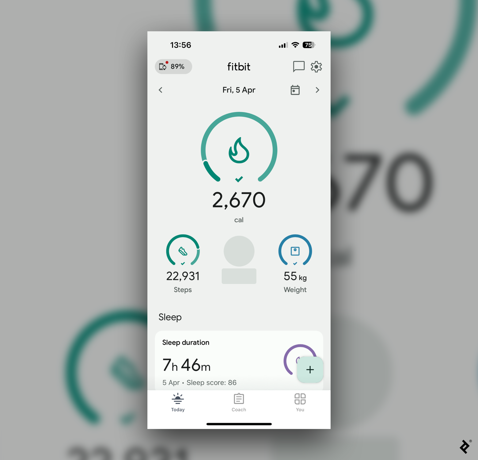
One way to do this is to prompt users to set goals and then help them track their progress. Designers can implement visual progress indicators or checkpoints that help users see their progress and accomplishments. In Fitbit’s mobile app, for example, users can set goals and then view progress indicators, completion bars, and microinteractions that visually represent their activity levels and how close they are to achieving their daily goals. Users also earn badges for hitting milestones or maintaining a consistent activity level, providing positive reinforcement. These visual indicators motivate users to stay consistent with their fitness routines, ultimately increasing the likelihood of meeting their objectives (and continuing on as customers).

You can tap into the power of commitment even without prompting users to set their own goals. For instance, an interactive onboarding process might gradually introduce users to features or implement feature-unlocking mechanisms that reveal additional functionalities as users interact more with the product. Mailchimp progressively reveals advanced email marketing automation tools to users as they grow their subscriber lists and engage with the platform. As users reach specific milestones, such as a certain number of contacts added or email campaigns sent, they unlock additional automation features like triggered emails and audience segmentation.
When my team and I designed the programming learning app Programming Hero, we introduced a feature allowing users to set personal goals and share them within the app’s community or on their social media. This public commitment motivated users to maintain consistency as they learned. They could see their global and local ranking, and friends could also view their progress.
We also incorporated customized reminders, progress tracking, and motivational content tailored to user goals to support them in adhering to their pledges. For example, if a user commits to practicing daily, the app sends gentle reminders with suggested routines. This strategy has led to a 20% increase in daily app usage and a 15% improvement in user retention.
Build User Trust With Social Proof
When making decisions, individuals are often influenced by the choices or actions of other people, a tendency known as social proof. Designers can leverage this concept to encourage users to try products or services by showing them that others are doing the same. They can integrate social media feeds, likes, shares, and comments directly within a product’s user interface to demonstrate social engagement and validation.
Similarly, enabling users to leave reviews and ratings and participate in real-life case studies and success stories showcases positive experiences with the product or service. Airbnb integrates social proof by displaying user reviews, ratings, and testimonials for accommodations on its platform. The company’s focus on customer feedback is critical to maintaining its position as a leading platform in the hospitality industry.
Designers interested in conversion rate optimization can also incorporate visual popularity indicators for best-selling items, most-watched videos, and more to guide users toward popular choices. YouTube’s Trending tab features a curated list of the latest crowd-pleasing videos, accompanied by view counts, likes, and comments. This can spark intrigue and engagement from other potential customers who want to know what the buzz is about.
I leveraged social proof to further improve conversion rates at DoorProfit by incorporating reassuring microcopy and success stories from satisfied real estate investors on the website’s homepage.

These changes enhanced the homepage user experience and bolstered our credibility. Qualitative feedback from a focus group of 12 paid users revealed that the majority found that including testimonials and credentials on the homepage boosted their confidence in their decision to sign up.
Leverage the Scarcity Principle for Better Engagement
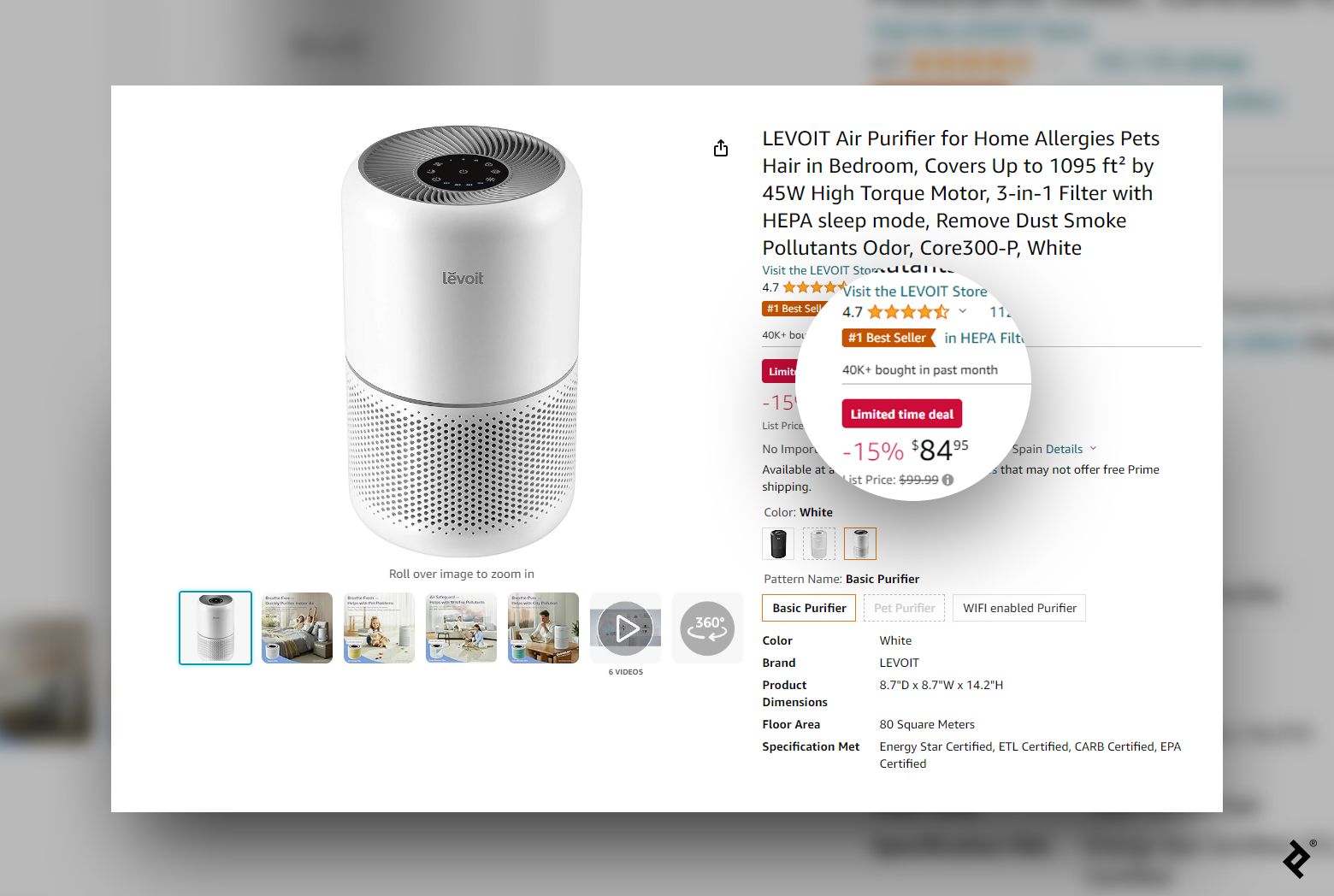
In social psychology, scarcity refers to the idea that people tend to see things as more valuable when they are limited or rare. Applying scarcity elements to a website or to an app’s design can drive desired actions. For example, using countdown timers or clocks when designing for promotions and flash sales on e-commerce sites instills a sense of urgency, such as during Black Friday and Cyber Monday sales. Another approach is to display notifications or alerts indicating low stock levels for popular items. Amazon displays messages such as “Only X items left in stock” or “Limited stock available” to leverage the power of scarcity and give motivated customers a chance to buy before the inventory runs out. And while creating a sense of urgency can encourage buyers to act quickly, it is crucial that these tactics are employed truthfully. Fabricating scarcity can erode trust and damage a brand’s reputation, so integrity is key when applying this principle.

User experience designers can also generate buzz and motivate users to secure items in advance by implementing waitlists or preorder options for high-demand products on e-commerce sites. They might include prominent and appealing visual elements, such as call-to-action (CTA) buttons with compelling copy to encourage users to join a waitlist or preorder. Amazon places clear preorder buttons on product pages, making it easy for users to find highly anticipated products or limited editions.
As the Lead Product Designer at Truck Lagbe, Bangladesh’s first and largest online truck-hiring platform, I applied the scarcity principle to aid UX and conversion optimization. Initially, shippers would send requests for trucks and receive multiple price offers from drivers. This process led to delays in decision-making and confusion among shippers and drivers. More than 75% of requests went unmatched, causing high customer churn and damaging the company’s reputation in the trucking industry.
To resolve this, we made the offers available for a limited time only. This adjustment created a sense of urgency for shippers, persuading them to act quickly. Shipper-driver matching improved by 200%, which streamlined operations and improved user retention.
Design for Conversion: Harnessing Human Behavior Principles Successfully
Human psychology is a powerful tool for designing products that drive user engagement and sales. By recognizing and anticipating how users are likely to think and behave, designers can ensure that their work aligns with these patterns, leading to a better user experience. Incorporating human behavioral principles into my design approach has not only enhanced user experiences but also fostered lasting engagement and advocacy for the products and services I help create.


