How to Make Proximity Maps with Python | by Lee Vaughan | Oct, 2024

Here’s the full code (written in JupyterLab). I’ll break down the code blocks in the following sections.
import numpy as np
import matplotlib.pyplot as plt
import pandas as pd
import geopandas as gpd
from geopy.distance import great_circle# SEC schools with coordinates (coords by ChatGPT4):
data = {
'school': ['Alabama', 'LSU', 'Ole Miss', 'Miss State',
'Auburn', 'Arkansas', 'Missouri', 'Vanderbilt',
'Tennessee', 'Florida', 'Georgia', 'Kentucky',
'S. Carolina', 'TAMU', 'Texas', 'Oklahoma'],
'latitude': [33.209, 30.412, 34.365, 33.456,
32.603, 36.068, 38.951, 36.162,
35.960, 29.651, 33.950, 38.049,
34.000, 30.620, 30.284, 35.222],
'longitude': [-87.538, -91.177, -89.526, -88.811,
-85.484, -94.172, -92.328, -86.784,
-83.920, -82.324, -83.377, -84.500,
-81.034, -96.340, -97.740, -97.445]
}
df = pd.DataFrame(data)
# Pick a school to plot the distance from.
# Use the same name as in the previous data dict:
SCHOOL = 'Texas'
# Set the grid resolution.
# Larger = higher res and smoother contours:
RESOLUTION = 500
# Get coordinates for SCHOOL:
school_index = df[df['school'] == SCHOOL].index[0]
school_coords = df.loc[school_index, ['latitude', 'longitude']].to_numpy()
# Create grid of points for interpolation:
x_min, x_max = df['longitude'].min(), df['longitude'].max()
y_min, y_max = df['latitude'].min(), df['latitude'].max()
xx, yy = np.meshgrid(np.linspace(x_min, x_max, RESOLUTION),
np.linspace(y_min, y_max, RESOLUTION))
# Calculate distances from SCHOOL to every point in grid:
distances = np.zeros(xx.shape)
for i in range(xx.shape[0]):
for j in range(xx.shape[1]):
point_coords = (yy[i, j], xx[i, j])
distances[i, j] = great_circle(school_coords, point_coords).miles
# Create the color-filled contour map:
fig, ax = plt.subplots(1, 1, figsize=(10, 8))
contour = ax.contourf(xx, yy, distances,
cmap='coolwarm',
alpha=0.9)
cbar = fig.colorbar(contour, ax=ax, shrink=0.7)
cbar.set_label(f'Distance from {SCHOOL} (miles)')
ax.scatter(df['longitude'], df['latitude'], s=2, color='black')
# Load state boundaries from US Census Bureau:
url = 'https://www2.census.gov/geo/tiger/GENZ2021/shp/cb_2021_us_state_20m.zip'
states = gpd.read_file(url)
# Filter states within the map limits:
states = states.cx[x_min:x_max, y_min:y_max]
# Plot the state boundaries:
states.boundary.plot(ax=ax, linewidth=1, edgecolor='black')
# Add labels for the schools:
for i, school in enumerate(df['school']):
ax.annotate(
school,
(df['longitude'][i], df['latitude'][i]),
textcoords="offset points",
xytext=(2, 1),
ha='left',
fontsize=8
)
ax.set_xlabel('Longitude')
ax.set_ylabel('Latitude')
ax.set_title(f'Distance from {SCHOOL} to Other SEC Schools')
# fig.savefig('distance_map.png', dpi=600)
plt.show()
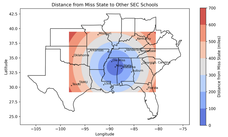
And here’s the output, showing the distance from the University of Texas in Austin to the other SEC schools:
Importing Libraries
This project requires NumPy, Matplotlib, pandas, geopandas, geopy, and scipy. You can find installation instructions in the links.
import numpy as np
import matplotlib.pyplot as plt
import pandas as pd
import geopandas as gpd
from geopy.distance import great_circle
Loading Data
For the input data, I made a list of the schools and then had ChatGPT produce the dictionary with the lat-lon coordinates. The dictionary was then converted into a pandas DataFrame named df.
# SEC schools with coordinates (coords by ChatGPT4):
data = {
'school': ['Alabama', 'LSU', 'Ole Miss', 'Miss State',
'Auburn', 'Arkansas', 'Missouri', 'Vanderbilt',
'Tennessee', 'Florida', 'Georgia', 'Kentucky',
'S. Carolina', 'TAMU', 'Texas', 'Oklahoma'],
'latitude': [33.209, 30.412, 34.365, 33.456,
32.603, 36.068, 38.951, 36.162,
35.960, 29.651, 33.950, 38.049,
34.000, 30.620, 30.284, 35.222],
'longitude': [-87.538, -91.177, -89.526, -88.811,
-85.484, -94.172, -92.328, -86.784,
-83.920, -82.324, -83.377, -84.500,
-81.034, -96.340, -97.740, -97.445]
}df = pd.DataFrame(data)
Assigning Constants
The code will produce a distance map from one of the listed SEC schools. We’ll assign the school’s name (typed exactly as it appears in the dictionary) to a constant named SCHOOL.
# Pick a school to plot the distance from.
# Use the same name as in the data dict:
SCHOOL = 'Texas'
To control the “smoothness” of the contours, we’ll use a constant named RESOLUTION. The larger the number, the finer the underlying grid and thus the smoother the contours. Values around 500–1,000 produce good results.
# Set the grid resolution.
# Larger = higher res and smoother contours:
RESOLUTION = 500
Getting the School Location
Now to get the specified school’s map coordinates. In this case, the school will be the University of Texas in Austin, Texas.
# Get coordinates for SCHOOL:
school_index = df[df['school'] == SCHOOL].index[0]
school_coords = df.loc[school_index, ['latitude', 'longitude']].to_numpy()
The first line identifies the DataFrame index of the school specified by the SCHOOL constant. This index is then used to get the school’s coordinates. Because index returns a list of indices where the condition is true, we use [0] to get the first (presumably only) item in this list.
Next, we extract latitude and longitude values from the DataFrame and convert them into a NumPy array with the to_numpy() method.
If you’re unfamiliar with NumPy arrays, check out this article:
Creating the Grid
Before we make a contour map, we must build a regular grid and populate the grid nodes (intersections) with distance values. The following code creates the grid.
# Create grid of points for interpolation:
x_min, x_max = df['longitude'].min(), df['longitude'].max()
y_min, y_max = df['latitude'].min(), df['latitude'].max()
xx, yy = np.meshgrid(np.linspace(x_min, x_max, RESOLUTION),
np.linspace(y_min, y_max, RESOLUTION))
The first step here is to get the min and max values (x_min, x_max and y_min, y_max) of the longitude and latitude from the DataFrame.
Next, we use NumPy’s meshgrid() method to create a grid of points within the bounds defined by the min and max latitudes and longitudes.
Here’s how the grid looks for a resolution of 100:
Each node will hold a value that can be contoured.
Calculating Distances
The following code calculates concentric distances from the specified school.
# Calculate distances from SCHOOL to every point in grid:
distances = np.zeros(xx.shape)
for i in range(xx.shape[0]):
for j in range(xx.shape[1]):
point_coords = (yy[i, j], xx[i, j])
distances[i, j] = great_circle(school_coords, point_coords).miles
The first order of business is to initialize a NumPy array called distances. It has the same shape as thexx grid and is filled with zeroes. We’ll use it to store the calculated distances from SCHOOL.
Next, we loop over the rows of the grid, then, in a nested loop, iterate over the columns of the grid. With each iteration we retrieve the coordinates of the point at position (i, j) in the grid, with yy and xx holding the grid coordinates.
The final line calculates the great-circle distance (the distance between two points on a sphere) from the school to the current point coordinates (point_coords). The ultimate result is an array of distances with units in miles.
Creating the Map
Now that we have x, y, and distance data, we can contour the distance values and make a display.
# Create the color-filled contour map:
fig, ax = plt.subplots(1, 1, figsize=(10, 8))
contour = ax.contourf(xx, yy, distances,
cmap='coolwarm',
alpha=0.9)
cbar = fig.colorbar(contour, ax=ax, shrink=0.7)
cbar.set_label(f'Distance from {SCHOOL} (miles)')
ax.scatter(df['longitude'], df['latitude'], s=2, color='black')
We start by setting up a Matplotlib figure of size 10 x 8. If you’re not familiar with the fig, ax terminology, check out this terrific article for a quick introduction:
To draw the color-filled contours we use Matplotlib’s contourf() method. It uses the xx, yy, and distancesvalues, the coolwarm colormap, and a slight amount of transparency (alpha=0.9).
The default color bar for the display is lacking, in my opinion, so we customize it somewhat. The fig.colorbar() method adds a color bar to the plot to indicate the distance scale. The shrink argument keeps the height of the color bar from being disproportionate to the plot.
Finally, we use Matplotlib’s scatter() method to add the school locations to the map, with a marker size of 2. Later, we’ll label these points with the school names.
Adding the State Boundaries
The map currently has only the school locations to use as landmarks. To make the map more relatable, the following code adds state boundaries.
# Load state boundaries from US Census Bureau:
url = 'https://www2.census.gov/geo/tiger/GENZ2021/shp/cb_2021_us_state_20m.zip'
states = gpd.read_file(url)# Filter states within the map limits:
states = states.cx[x_min:x_max, y_min:y_max]
# Plot the state boundaries:
states.boundary.plot(ax=ax, linewidth=1, edgecolor='black')
The third line uses geopandas’ cx indexer method for spatial slicing. It filters geometries in a GeoDataFrame based on a bounding box defined by the minimum and maximum x (longitude) and y (latitude) coordinates. Here, we filter out all the states outside the bounding box.
Adding Labels and a Title
The following code finishes the plot by tying up a few loose ends, such as adding the school names to their map markers, labeling the x and y axes, and setting an updateable title.
# Add labels for the schools:
for i, school in enumerate(df['school']):
ax.annotate(
school,
(df['longitude'][i], df['latitude'][i]),
textcoords="offset points",
xytext=(2, 1),
ha='left',
fontsize=8
)ax.set_xlabel('Longitude')
ax.set_ylabel('Latitude')
ax.set_title(f'Distance from {SCHOOL} to Other SEC Schools')
fig.savefig('distance_map.png', dpi=600)
plt.show()
To label the schools, we use a for loop and enumeration to choose the correct coordinates and names for each school and use Matplotlib’s annotate() method to post them on the map. We use annotate() rather than the text() method to access the xytext argument, which lets us shift the label to where we want it.


