How I Turned IPL Stats into a Mesmerizing Bar Chart Race | by Tezan Sahu | Oct, 2024

In our fast-paced digital world, capturing and maintaining audience attention is more challenging than ever. This is where animated visualizations shine. They can:
- Convey complex trends over time in an easily digestible format
- Engage viewers emotionally, making data more memorable
- Encourage exploration and discovery within datasets
- Simplify the communication of key insights to non-technical audiences
As data professionals, it’s crucial we stay abreast of these powerful storytelling tools. Let’s dive into how we can leverage them effectively.
As an avid cricket enthusiast, I knew I wanted to do something related to the Indian Premier League (IPL). But I didn’t want to create just another run-of-the-mill visualization. No, I wanted something that would make even the most casual cricket fan sit up and take notice.
That’s when it hit me: what if I could show the number of wins for each IPL team over time? It would be like watching the entire history of the IPL unfold before your eyes!
A quick search on Kaggle led me to a goldmine — a comprehensive IPL dataset containing match results from 2008 to 2024. I downloaded it faster than Jasprit Bumrah’s yorker and saved it as ipl_matches_2008-2024.csv.
Now armed with my dataset, I faced the daunting question: how on earth do I turn this into one of those fancy animated charts?
While I’m comfortable with coding visualizations from scratch using Python, I was intrigued by the potential efficiency of low-code tools. Enter Flourish — a tool I stumbled upon that promised to help create stunning visualizations without coding — how cool is that!
The range of options for visualisations provided by Flourish is great (even for free-tier usage). On selecting the “Bar chart race” option, followed by clicking the “Data” toggle, I was quickly able to understand the data requirements for Flourish to generate a bar chart race visualization for us.
Of course, the raw IPL dataset was nowhere close to this format, which means I got the opportunity to leverage the power of GitHub Copilot to massage the data & bring it into the required format.
Here’s the sequence of interactions I had with GitHub Copilot to help me convert the raw IPL data into the desired format (with a bunch of interesting IPL-related nuances):
As a first step, I broadly explained the format that the dataset was originally in, and how I wanted the final representation:
Here’s the result returned by GitHub Copilot:
I was pleasantly surprised to find that this piece of code was almost correct in the first go itself! The process shown is simple:
After extracting the unique dates of each match & the unique teams, initialize a data frame with teams as rows & dates as columns. Now, iterate through each date & do the following:
- Filter matches up to the current date
- Calculate the cumulative wins for each team
- Update the DataFrame with the cumulative wins
The only hiccup here was this extra piece of code — removing which, did the trick for me:
# Ensure cumulative sum
if date != unique_dates[0]:
cumulative_wins.at[team, date] += cumulative_wins.at[team, unique_dates[unique_dates.index(date) - 1]]
cumulative_wins.head() resulted in the following:
But wait, there’s more! The IPL, like any good drama, has its own twists and turns…
Although this data, by itself, is sufficient to be visualized in Flourish as a bar chart race, I decided to address some of the nuances of IPL that will give the visualization a more realistic feel.
Team Renaming
Throughout the IPL history, there have been multiple occasions where franchise owners changed, leading to the rebranding of the teams Remember when Deccan Chargers transformed into Sunrisers Hyderabad?
In the dataset, these are considered separate teams in separate rows, where post renaming, the old team continues to stay with the cumulative number of wins until that year, while the new team starts afresh with 0 wins.
To change this, I tried out the following prompts:
With a couple of minor fixes, this is what the resulting code looked like:
Now, to generalize this & apply it across the various changes, I tried converting his into a function & used Bing to figure out the years of these major team changes, before applying the function to them:
Awesome! I was able to account for all the franchise changes that happened over the years. Still, one thing bothered me…
Defunct Teams
A bunch of teams in the IPL appeared in just a couple of editions & then faded away. Their presence in the final visualisation after them being made defunct seemed unnecessary.
So, I tried to have them removed after their final appearance using the following prompt:
This gave me another neat function, which I could apply to the teams that went defunct over the years (again, I found this data from Bing).
Team Logos
In the demo data in Flourish, I observed that one column contained links to images that could be used for each bar in the bar chart race.
To make my visualization pop out, I wished to do something similar. So, I found the images for the logos for each of the unique teams in our dataset & added them to a new column:
This small touch significantly enhances the viewer’s ability to track teams throughout the animation
And now, I was all set to create the visualization!
With our data primed and polished, it was time for the main event!
Uploading to Flourish was a piece of cake —it was automatically able to identify the Label, Values & Image columns correctly.
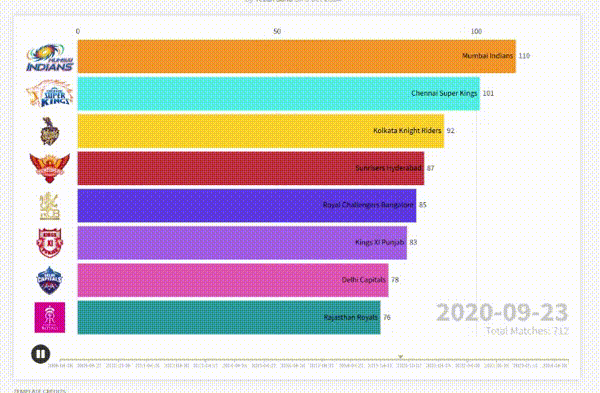
Switching to the Preview toggle, I had something that almost resembled what I had envisioned — a couple of setting changes here & there, and we were done.
Following are the changes I made:
- Used “Labels on bars (images in axis)” as the “Labels mode” under Labels for a sleek look
- Set image sizing to “Fit” and shape to “Rectangle” for crisp logos
- Reduced the Size % of the Current Time Counter & Totalizer under Counter & Totalizer for balance
And there you have it — from a simple CSV file to a dynamic, engaging visualization that tells the story of IPL team performances over the years — with just a dash of creativity and a sprinkle of data magic. 🎉
Here’s the final output👇🏼
This simple-yet-engaging project holds several valuable insights for data scientists and analysts looking to enhance their storytelling toolkit:
- Low-Code Doesn’t Mean Low-Quality: Tools like Flourish can produce sophisticated visualizations that rival custom-coded solutions.
- Data Prep Remains Critical: Our data science skills are invaluable in preparing and structuring data for effective visualization.
- Efficiency Gains: For certain projects, low-code tools can significantly reduce time-to-insight without sacrificing quality.
- Accessibility: These tools can help bridge the gap between data teams and non-technical stakeholders, facilitating better communication of insights.


