Mental Health App Design for Families: Case Study

The global mental health app market is expected to hit $7.18 billion in 2024, up from $6.22 billion in 2023. Unfortunately, research suggests that users of mental health apps often encounter usability problems, including a lack of personalized support, intervention, or resources, an inconsistent user experience, and complex or confusing interfaces. In short, poor design can render even the most potentially beneficial apps ineffective and drive customers away.
That means there is a significant opportunity for newcomers in the mental health app space to improve upon existing UI design and make it easier for users to benefit. For example, in 2022, a San Francisco-based startup developing a mental health app for families brought me in to create an engaging, intuitive, and family-friendly prototype to present to investors.
The project was a success: The company received $22 million in funding and officially launched in 2022. But the road to getting there included many design challenges. Here, I discuss the problems my team faced in the early design process—including a tedious onboarding experience, a confusing navigation flow, and an uninviting app interface—and how we overcame them.
Putting Users Front and Center in the Design Process
When I joined the project, the company’s research team had already homed in on the intended app audience by conducting user research, identifying common user segments, and creating user personas. The three personas were children facing mental health challenges such as anxiety, depression, ADHD, and behavioral problems; family members and primary caregivers seeking to support these children; and healthcare professionals providing care to the children and their families.
My design team began by mapping out user flows and determining what features would meet the needs of the user personas. Using Figma, we created low-fidelity wireframes of the app’s screens to piece together where users would start their journey, how they would navigate to other pages, and the key actions they would need to take to complete a task. We established that there would be four key areas within the app:
- An overview of the app’s features where families would find helpful information such as appointment reminders and suggested resources
- A communication portal where children could connect with healthcare specialists via video and chat sessions
- A resource hub for families and caregivers that included articles, white papers, downloads, and toolkits
- An area for reports and related documents that families and caregivers could view to track their children’s progress
Next, we conducted usability testing on our initial wireframes with internal stakeholders to analyze our assumptions about the user flow. Above all, we wanted to determine how many steps were required to achieve specific goals, such as completing the onboarding process and reaching a relevant article in the resource hub. This activity helped us discover where to simplify overly complex workflows and create more intuitive navigation flows.
Taking the First Step: Onboarding
Therapy app onboarding should offer a comfortable entry point for visitors who may already be in distressing situations when they first encounter the app. Unfortunately, the nature of this app meant we had to gather fairly extensive information during onboarding in order to offer relevant treatment plans—and our initial onboarding flow comprised several long forms and a long list of questions that families would need to answer before reaching the app’s core features.
Since shortening the onboarding flow wasn’t possible, we aimed to make it more interactive and manageable instead.
First, we broke the onboarding process down step by step to give users a clear sense of where they were and what was next. We added determinate progress indicators to help users visualize the number of steps until completion. A “Back” call-to-action button allowed users to navigate back to a previous step to rectify erroneous information, and a “Next” button enabled them to move forward through corrected steps. We also added an autosave feature so users wouldn’t lose their progress in case of unexpected disruptions, such as accidental app closure.
Another overarching improvement was the addition of clear visual prompts to the onboarding flow. Studies show that digesting information can feel overwhelming when it is difficult to visualize. Strong visual orientation (icons, arrows, progress indicators, tooltips, and animations, etc.) helps signal required actions, next steps, or key information users must pay attention to.
We also improved the presentation of the multiple-choice questions by creating a clear visual hierarchy that distinguished each question from its possible answers through differences in font weight, size, and color. Each possible response was placed on a separate line in a clearly visible, clickable box. Additionally, the chosen answer was highlighted with a darker color to reinforce user input, minimize errors, and clearly show that these were single-select questions.
Making Resources Easy to Find With Intuitive Navigation
The app offered an impressive amount of helpful information in the user resource hub, but we found that the initial design of that part of the app had no clear hierarchy or logical categorization, making it appear disorderly and overwhelming. A parent seeking content on separation anxiety would have to scroll through the entire resource hub to find relevant content, rather than simply navigating to a suitable category.
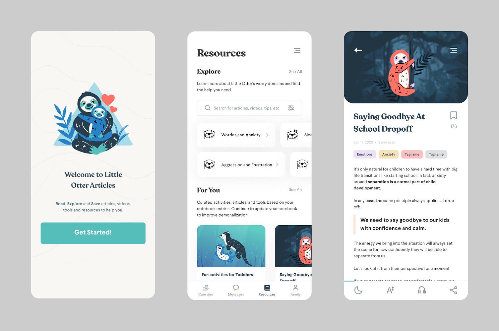
We started by creating a welcome screen with three main areas: reading categories (Worries and Anxiety; Sleep and Bedtime; Anger and Aggression, etc.); personalized recommendations based on users’ previous reading habits within the app; and saved resources. Within the reading categories area, we implemented a horizontal scrolling feature—often used in content segmentation—that would allow users to quickly scan different topics without excessive vertical scrolling. Users could also select a reading category to browse its articles.

We then designed the article cards. A preview of each article was displayed on a large card, to help users efficiently assess its relevance and engagement potential before committing their time and attention. The cards included the article title, a hero image, estimated reading time, relevant age group, and category tags for similar topics. (We also made the tags clickable so users could easily jump to other articles of interest.)
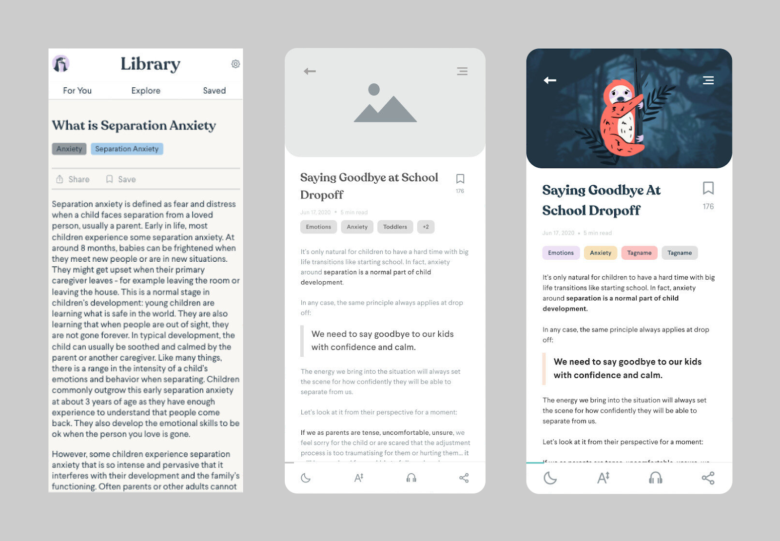
In addition, we worked to improve the reading experience for each article and incorporate features to help busy parents and caregivers get the most out of the resource hub. We added a vertical progress bar to help users stay oriented within the text. And we included a text highlighter that preserved excerpts, topics, and insights to revisit later. We also added a “Save for later” button so users could return to articles.
Creating an Inviting Environment
Our final challenge was how to promote a welcoming and supportive experience for users through visual design. The company already had a style guide in place that defined color palettes, typography, and iconography. We now needed to harmonize these design elements in a way that felt inviting and positive for users navigating potentially sensitive or triggering topics.
The brand’s primary color palette was inspired by the cool greens, pale blues, and muted pinks and purples of the coastal Pacific Northwest—colors that are often considered to have a soothing effect. We worked mostly with those hues, but introduced pops of a few warmer colors to bring in more energy and hope, such as orange and yellow for resource category tags.
To create a clean, balanced, and organized layout, we added ample whitespace between UI components such as images, form fields, and buttons. Similarly, we increased the padding around the text in the call-to-action buttons to make sure the buttons were noticeable and large enough to easily tap on the go. We also increased the line height of the resource hub article text to make the content more digestible.
Finally, inspired by research that suggests nature imagery may help improve mood, we included peaceful animal imagery—in particular, a friendly otter who is displayed prominently throughout the app.

Building a successful mental health app requires a compassionate and pragmatic approach—and there is a gap in the marketplace for applications that outperform the competition in terms of excellent UI. The design process reaffirmed for me the value of working with user personas to gain key insights into users’ unique needs and preferences. Without this key data, we wouldn’t have been able to create a tailored app experience that addresses real-life concerns and resonates with the children and families who use it.


