Animating in Figma to Create Engaging Components
Animations can improve the usability of a web or mobile interface by guiding navigation, indicating progress in tasks, and providing feedback in response to user actions. Animating UI components in particular is an essential—if subtle—way to improve the user experience. For instance, when clicking a heart icon makes it pulse and turn red, or hovering over a button causes it to change color, the user receives instant feedback that cues them to transition to their next task.
In my six years of UI/UX design, I’ve created a range of animations, from animated microinteractions to complex scrolling effects. I’ve found that animating in Figma is beneficial because it allows the grouping of elements into components that can be reused and modified across multiple projects. I also rely on Figma’s “smart animate” feature, a straightforward tool for automating transitions.
In this step-by-step tutorial, I show fellow designers how to create three animated UI components in Figma: a Favorite icon, a call-to-action (CTA) button, and a product card.
Animating a “Favorite” Icon
A Favorite icon allows users to label an item as important or something they like, often as a way to save it for revisiting later. For example, Gmail has a star icon users can click to mark their important emails. This tutorial demonstrates how to create a similar star so that users can click or tap to mark items they like. The resulting animation will be quite simple—a subtle fade from white to blue—but it is minor details like these that make a product more engaging.
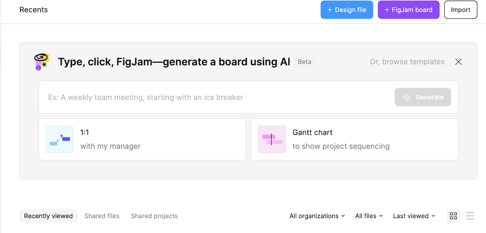
Start by clicking Design file in the upper-right corner of the Figma home page to open a new project.
Step 1: Create the Default Star
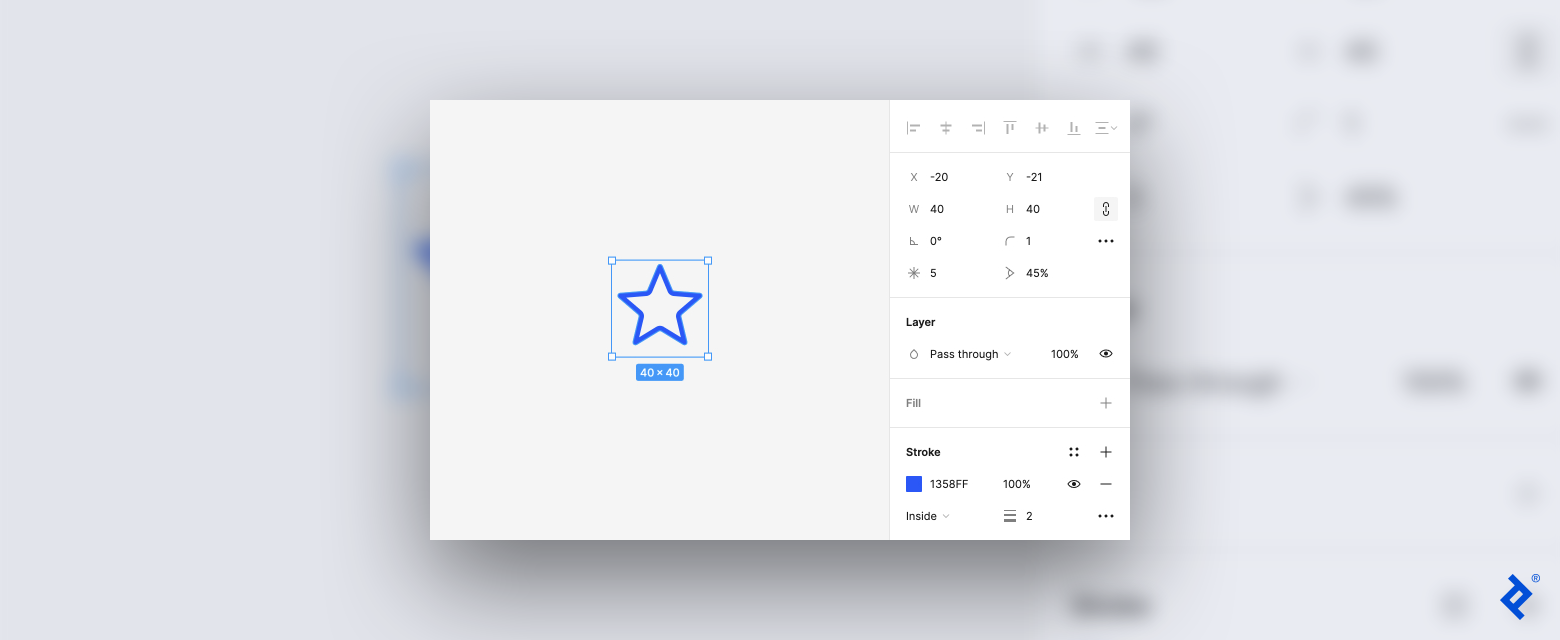
On the toolbar at the top of the screen (we’ll call this the top toolbar), click the shape tool—a square icon—on the left side to access the drop-down menu. Select the star from the menu and then click to draw the shape in your canvas. You should now have a gray star on your canvas.
Once you create the shape, a panel where you can customize the element’s angle, size, color, and effect opens on the right sidebar. Adjust the settings: Click the minus sign in the fill field to remove the gray fill, and choose the stroke color you want for the shape’s outline (I set mine to blue for this tutorial). You can also adjust the line’s thickness by changing the number next to the hamburger icon (I set mine to 2).
You’ve created the star’s default appearance (or how it looks before a user clicks it).
Step 2: Turn the Star Into a Component and Add a Variant
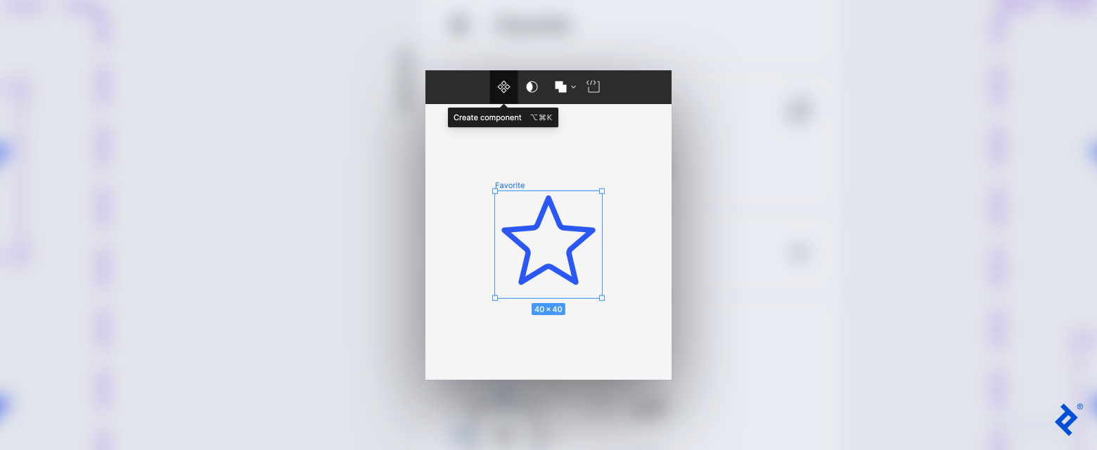
Click on the star, and then click Create component (the diamond icon) on the top toolbar to turn the star into a component.
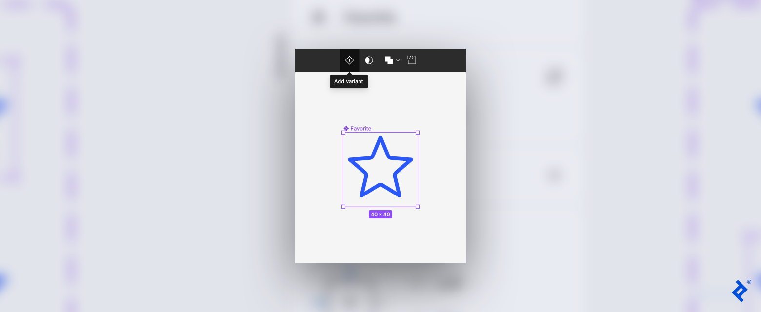
Next, add a variant, or a copy of the component that you can modify. On the top toolbar, click the Add variant icon (a plus sign in a diamond).
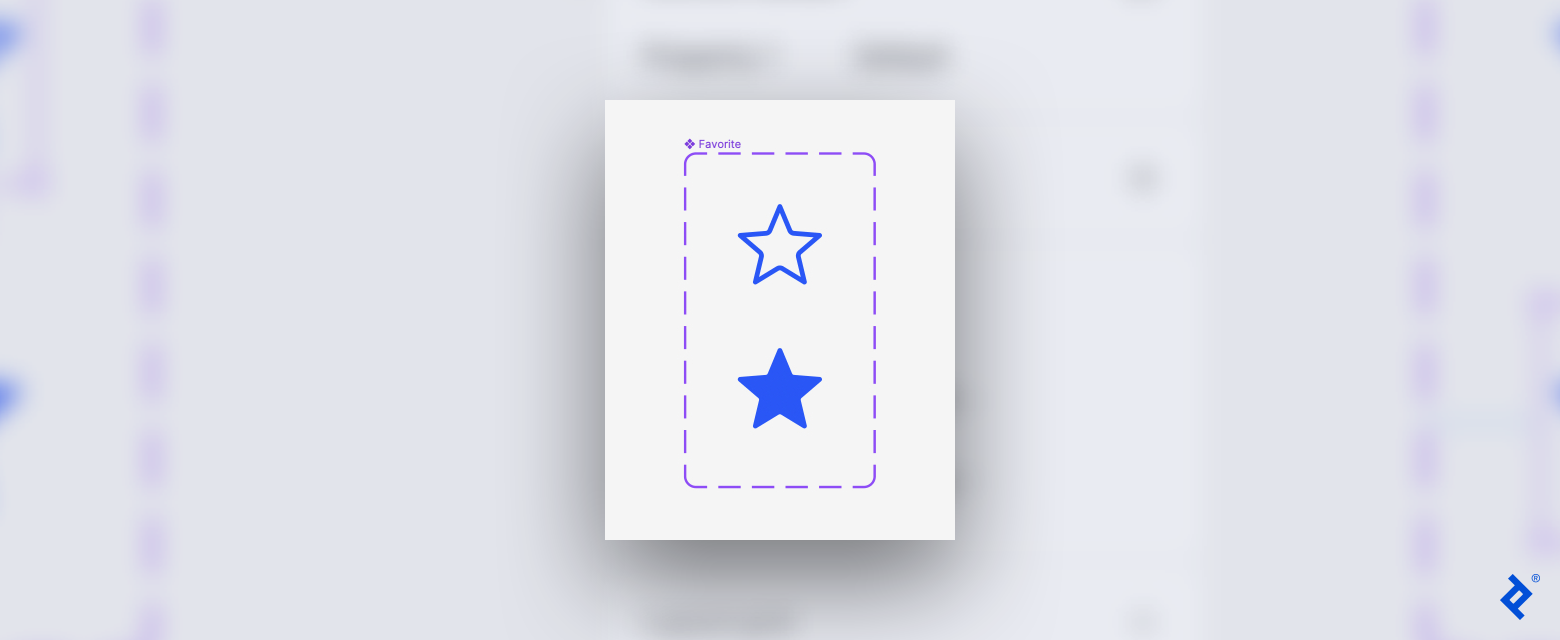
You now have a component set with two variants of the star. Double-click the second variant (the bottom star) to open the right sidebar and change the fill to match the stroke color using the matching tool or by copying the color code. The second variant is what the star will look like after the user clicks it.
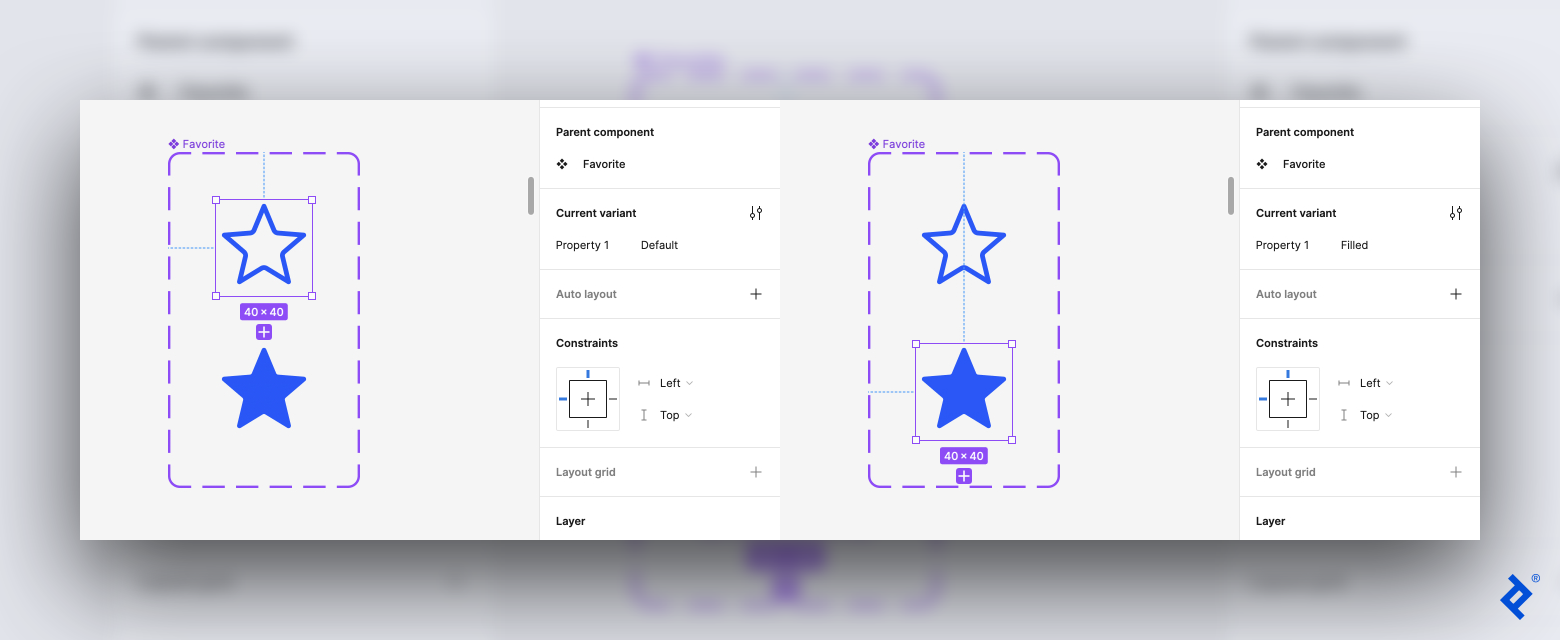
Next, let’s name the two variants. Select the first star. On the right sidebar, check that the Property 1 field reads default. Then click on the second star and change the Property 1 field to filled.
Step 3: Create the Transition Using Figma’s Smart Animate Feature
At the top of the right sidebar, switch from design mode to prototype mode. Select the default variant, and then hover your cursor over it until you see a small blue circle containing a plus sign on the edge of the variant.
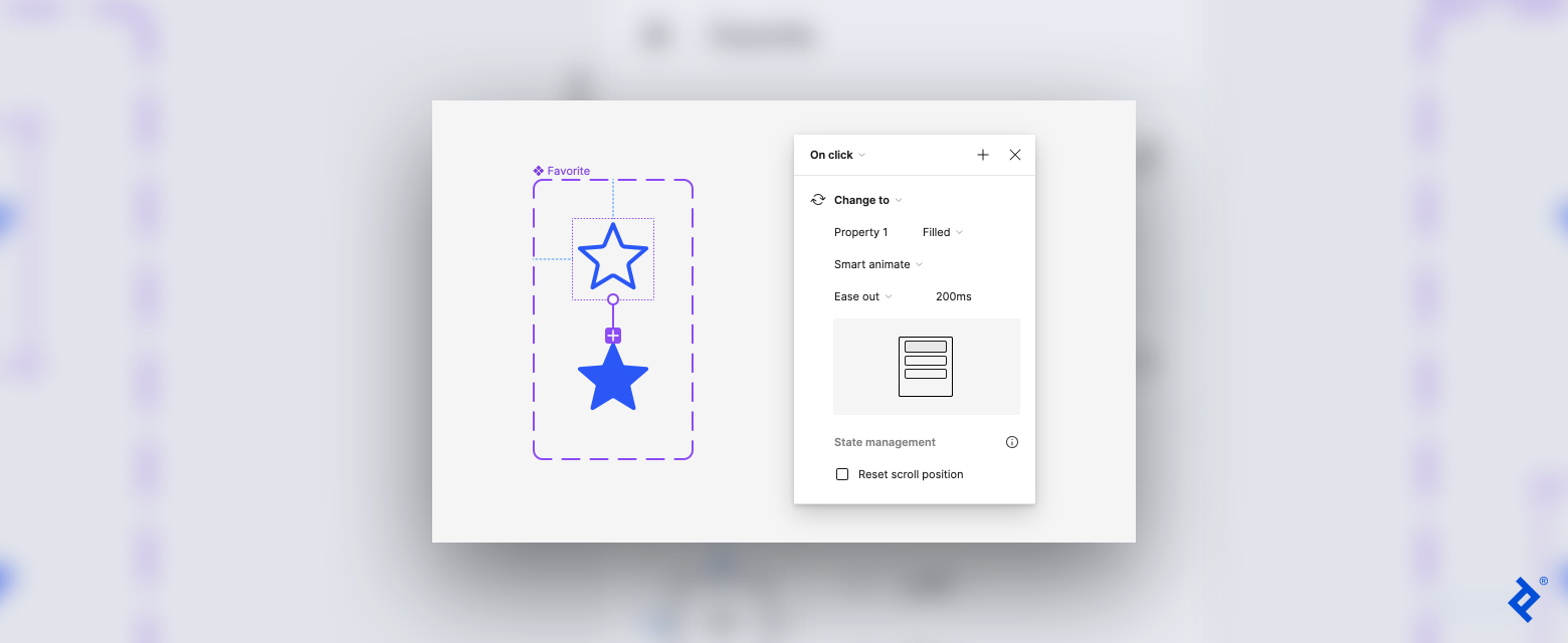
Click on the blue circle and drag it to the filled variant to create a connection. An arrow will appear between the two stars, and a panel with interaction settings will pop up.
Set the following properties in the pop-up settings:
- On click: The first setting in the pop-up is the trigger for the animation. We want the star to change when the user clicks it, so ensure that On click is selected from the drop-down menu.
- Change to: Next is the action that is triggered. In this case, the default star will Change to the filled star.
- Filled: Third is the destination, or what the star will change to. The second variant should already be set as the destination, but confirm that it reads filled next to Property 1.
- Smart animate: The fourth setting is the animation. The options are Instant, Dissolved, and Smart animate. Select Smart animate to automate a seamless transition.
- Ease out: Choose the type of transition as the star changes from default to filled. Select Ease out for the transition to start quickly and end slowly.
- Speed: This final setting is the speed of the transition in milliseconds. Set the speed to 200ms (0.2 seconds). This might seem fast, but the pace aligns with user expectations. No one wants to sit and watch lengthy or elaborate animations after each UI interaction.
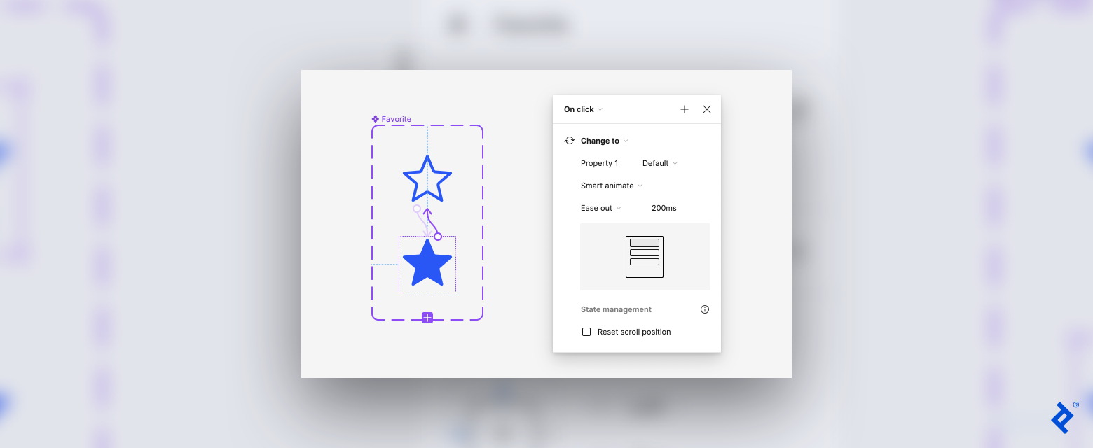
The transition from default to filled is complete—but what if the user wants to unfavorite an item or unmark an email and revert the star to the default version?
To enable this action, create another transition, but this time from filled to default. Select and hover over the filled variant and then click and drag the blue circle with the plus sign to the default variant. In the pop-up settings, keep the same properties as the last animation, except change Property 1 to default.
Step 4: Preview the Animation
To preview the animation, you first need to create a frame. Start by clicking the region tool on the left side of the top toolbar and choosing Frame from the drop-down menu. In the canvas, click and drag to open the frame, then copy and paste the default variant into the frame.
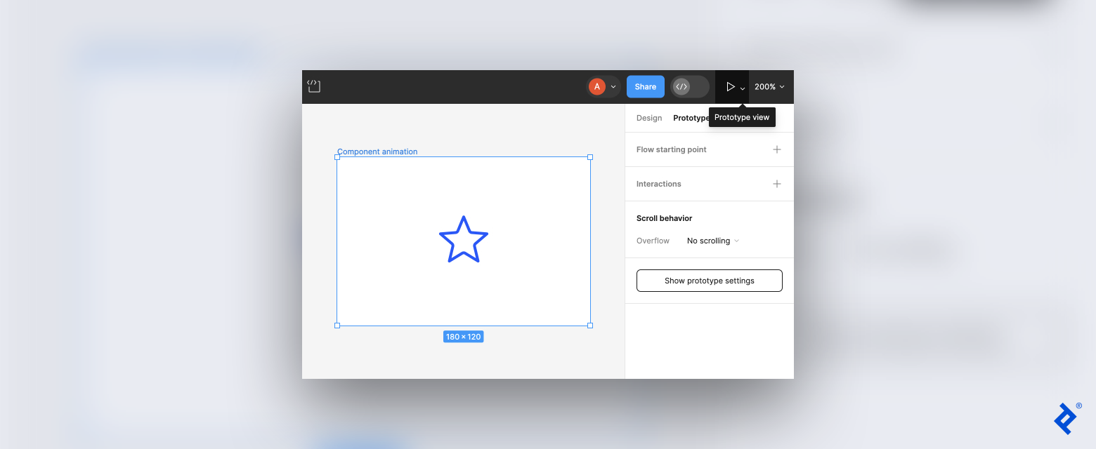
On the right side of the top toolbar, click the prototype view tool to open a drop-down menu with the options Present and Preview. To view the animation in a new window, select Present; to view it in your current window choose Preview. Once the preview opens, click on the star to test that the animation changes from default to filled and vice versa.
Here is a preview of the animated icon:

A Call-to-Action Button for Guiding Users
Next, we’ll build on the process we just learned to animate a CTA button. Here again, the animation will be subtle, but we’ll add another variant to the equation in order to create a rectangular button with three states: default, hover, and pressed.
Step 1: Create the Default Button
Working in the same design file that contains your Favorite icon, switch back to design mode. Click the shape tool in the top toolbar and select the rectangle. Click and drag in the canvas to draw a rectangle. In the right sidebar, change the fill color to your preferred color.
Click the text tool on the top toolbar, then add a text box inside the rectangle. Type “Read more” or your desired text into the box. On the right sidebar, adjust the text’s size, font, and color as desired. You can also customize your button—for instance, to give the button rounded edges, adjust the corner radius setting.
Step 2: Turn the Button Into a Component and Add Two Variants
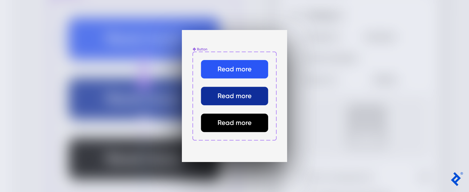
Use the selection tool to select the rectangle and text box. Click Create component in the top toolbar to convert it into a component. Next, click Add variant and a duplicate button will appear below the original button.
Then, with the second variant selected, click on the purple plus sign that appears. A third variant will appear below the second. You now have a component set with three variants.
Change the fill color of the second and third variants. I recommend making the colors progressively darker. I changed my second variant to a darker blue and my third variant to black.
Before we proceed, let’s name the three variants. Click on the first variant, and on the right sidebar confirm that the field next to Property 1 reads default. Select the second variant and change Property 1 to hovered. Finally, select the third variant and change Property 1 to pressed.
Step 3: Create the Transition by Using the Smart Animate Feature
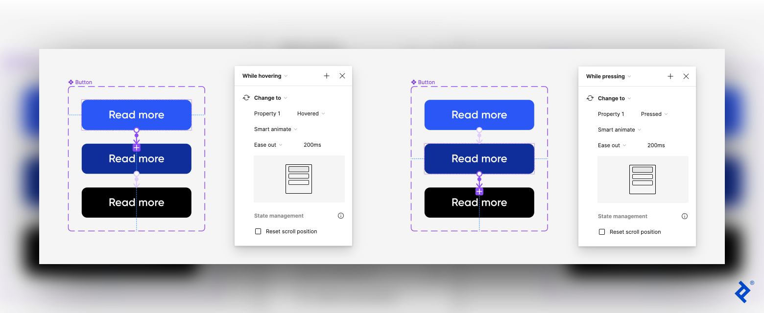
Now we create the transition from default to hovered. On the right sidebar, switch to prototype mode. Select the default variant and hover your cursor over it until a blue circle with a plus sign appears. Drag the blue circle to the hovered variant to create a connection. An arrow will appear between the two variants, and a panel with interaction settings will pop up.
Set the following properties in the pop-up settings:
- While hovering: We want the button to change color when the user hovers over it, so change the trigger to While hovering in the first drop-down menu.
- Change to: The action should be set to Change to.
- Hovered: The second variant should already be set as the destination, but confirm that it reads hovered next to Property 1.
- Smart animate: Select Smart animate from the animation options to automate a seamless transition.
- Ease out: Set the transition to Ease out.
- Speed: Set the speed of the transition to 200ms.
Repeat these steps for the third variant. Find the plus sign on the hovered variant and drag it to the pressed variant. Set the trigger to While pressing and check that Property 1 reads pressed. Keep the properties Smart animate, Ease out, and 200ms.
Step 4: Preview the Animation
To preview the animation, create a frame in the canvas. Copy the default variant into the frame. In the upper right-hand corner of the top toolbar, click on the prototype view tool and choose Preview to view the animation in the same window or Present to view it in a new window. This will open a preview so that you can check that the button changes from default to hovered to pressed.
Here is the preview of the button animation:

A Product Card That Grabs Attention
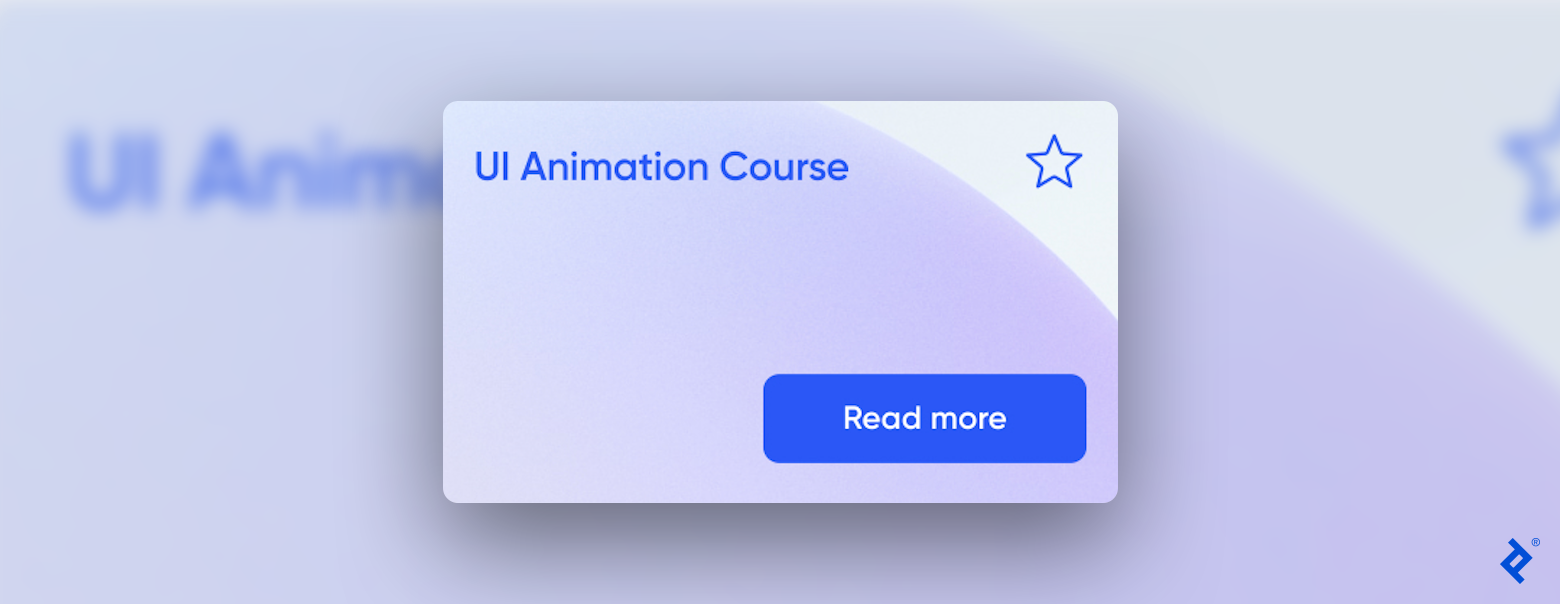
For the final UI animation tutorial, we create and animate a product card. Cards are popular UI components that display a snapshot of information and link to a page. The product card we create in this tutorial incorporates the Favorite and Read More buttons to demonstrate how components can be reused across projects. We also add a simple animation to the card that helps entice clicks.
Step 1: Create the Default Card
Working in the same design file that contains the two buttons, switch back to design mode. Click the shape tool located on the left side of the top toolbar and select the rectangle from the drop-down menu, then draw a rectangle in your canvas.
We use an image for the background of this card. Click the shape tool again, select Place image/video from the menu, and upload your desired image. Click on the rectangle you drew, and the image will appear inside the shape.
Next, add a text box and input your desired copy (for this example, I wrote “UI Animation Course”). Adjust the font, size, and placement of the text, copy the default variants of the Favorite and Read More buttons we created in the previous steps, and paste them onto the rectangle. In my card, I placed the text box at the top left, the Favorite icon at the top right, and the Read More button at the bottom right.
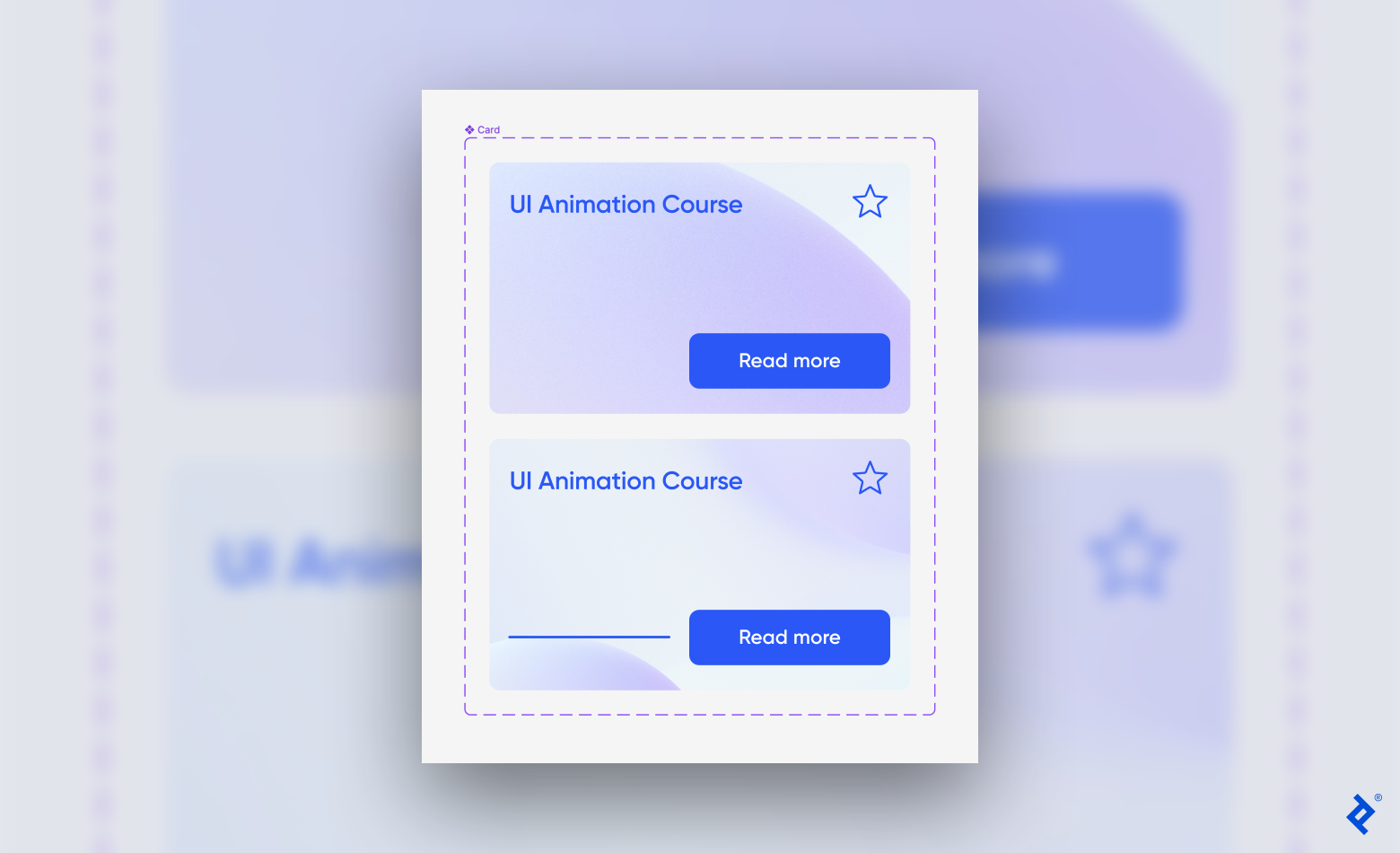
As a style choice, I want a line to appear at the bottom-left corner when the user hovers over the card. To create this, using the shape tool, select line and draw a short horizontal line on the rectangle next to the Read More button. Customize the line using the right sidebar; I adjusted mine to a 5px width and took the layer opacity to 0% so the line wasn’t visible in the default card.
Step 2: Turn the Card Into a Component and Add a Variant
Select all elements and convert them into a component using the Create component icon on the top toolbar. Next, click Add variant. The second variant will appear below the first. You now have a component set with two variants.
Double-click the second variant, and then click Crop on the top toolbar. You can now move the image inside the rectangle so that a different portion of it appears in the card. You can also make the image larger or smaller. Either of those options will create the illusion of movement in the animation.
Click on the horizontal line. On the right sidebar, change its opacity to 100%, and then lengthen the line.
Name the second variant by selecting it and typing in hovered next to Property 1 on the right sidebar.
Step 3: Create the Transition Using the Smart Animate Feature
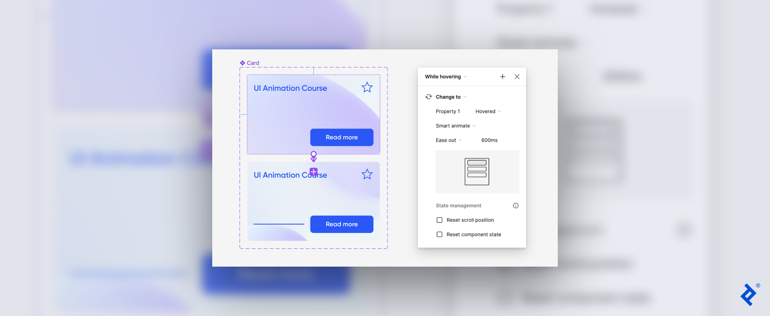
In the right sidebar, switch to prototype mode. Select the default variant, and hover the cursor over the card until the blue circle with a plus sign appears. Drag the blue circle to the hovered variant to create a connection. An arrow will appear between the two variants, and a panel with interaction settings will pop up.
Set the following properties in the pop-up settings:
- While hovering: We want the card to change when the user hovers over it, so change the trigger to While hovering from the first drop-down menu.
- Change to: The action should be set to Change to.
- Hovered: The second variant should already be set as the destination, but confirm that it reads hovered next to Property 1.
- Smart animate: Select Smart animate from the animation options to automate a seamless transition.
- Ease out: Set the transition to Ease out.
- Speed: Since this is a more complicated animation with multiple components at play, set it to a slower speed of 600 ms. This makes the transition smoother and gives the user more time to process the movement.
The Favorite icon and Read More button will retain the animations you already created for them, so you don’t need to adjust them further at this step.
Step 4: Preview the Animation
To preview the animation, create a frame in the canvas and copy the default variant into the frame. In the upper right-hand corner of the top toolbar, click on the prototype view tool and select Preview to view the animation in the same window or Present to view it in a new window. This will open a preview so you can check that the card works as intended. Test the animation by hovering over the card to watch the line and background change. Click on the button components to see the preset animations.
Here is a preview of the card animation:

Elevate the User Experience With Figma Animation
Once a designer masters the animation of foundational UI components, they can easily move on to more complex animations, such as scroll-triggered animations and animated data visualizations. Figma’s animation functionality works best for simple graphics and UI components; for more complex animations, such as motion graphics in a video or for 3D animations, I recommend using Adobe’s After Effects or Apple’s Motion.
The UI animations covered in this tutorial are a great place to start improving product usability. Even though I’m experienced at creating more intensive animations, I often use these simple effects in my work because they’re effective and efficient. Sometimes, elegant simplicity makes all the difference.


