Beyond Line and Bar Charts: 7 Less Common But Powerful Visualization Types | by Yu Dong | Sep, 2024

Step up your data storytelling game with these creative and insightful visualizations
In a previous article, I shared my journey of creating one visualization every week since 2018 — I have 350+ of them now on my Tableau Public profile! Not surprisingly, among all the visualization types, I have used bar charts and line charts the most. They are simple but highly effective and intuitive in telling stories. However, I sometimes feel bored making similar charts over and over again, and they could fail to demonstrate complex data patterns.
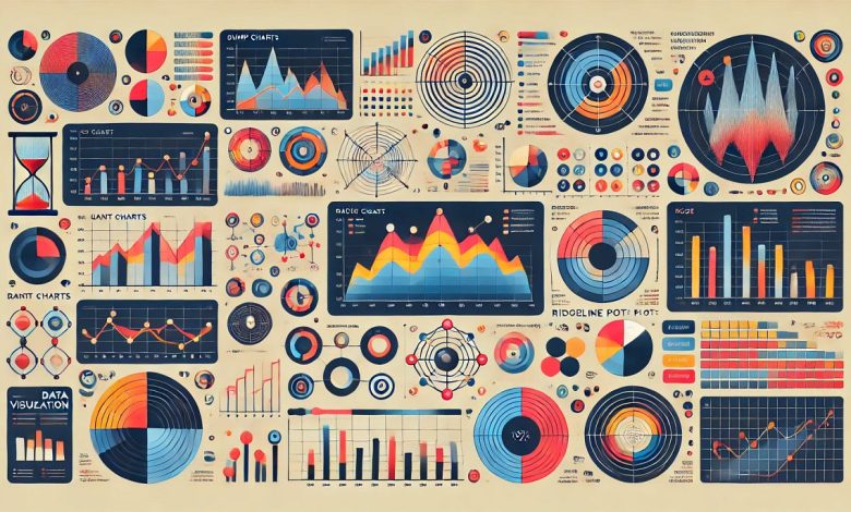
In this article, I will introduce seven less common but powerful visualization types. I will talk about their specific use cases, share my visualization examples, discuss their strengths and weaknesses, and show you how to create them in visualization tools like Tableau.
A bump chart is a special type of line chart that visualizes the change in rank of multiple categories over time. Its y-axis is the category ranks, so it shows how the categories “bump” each other up and down over time. Therefore, It is perfect to demonstrate the competition between categories.


